Attendease
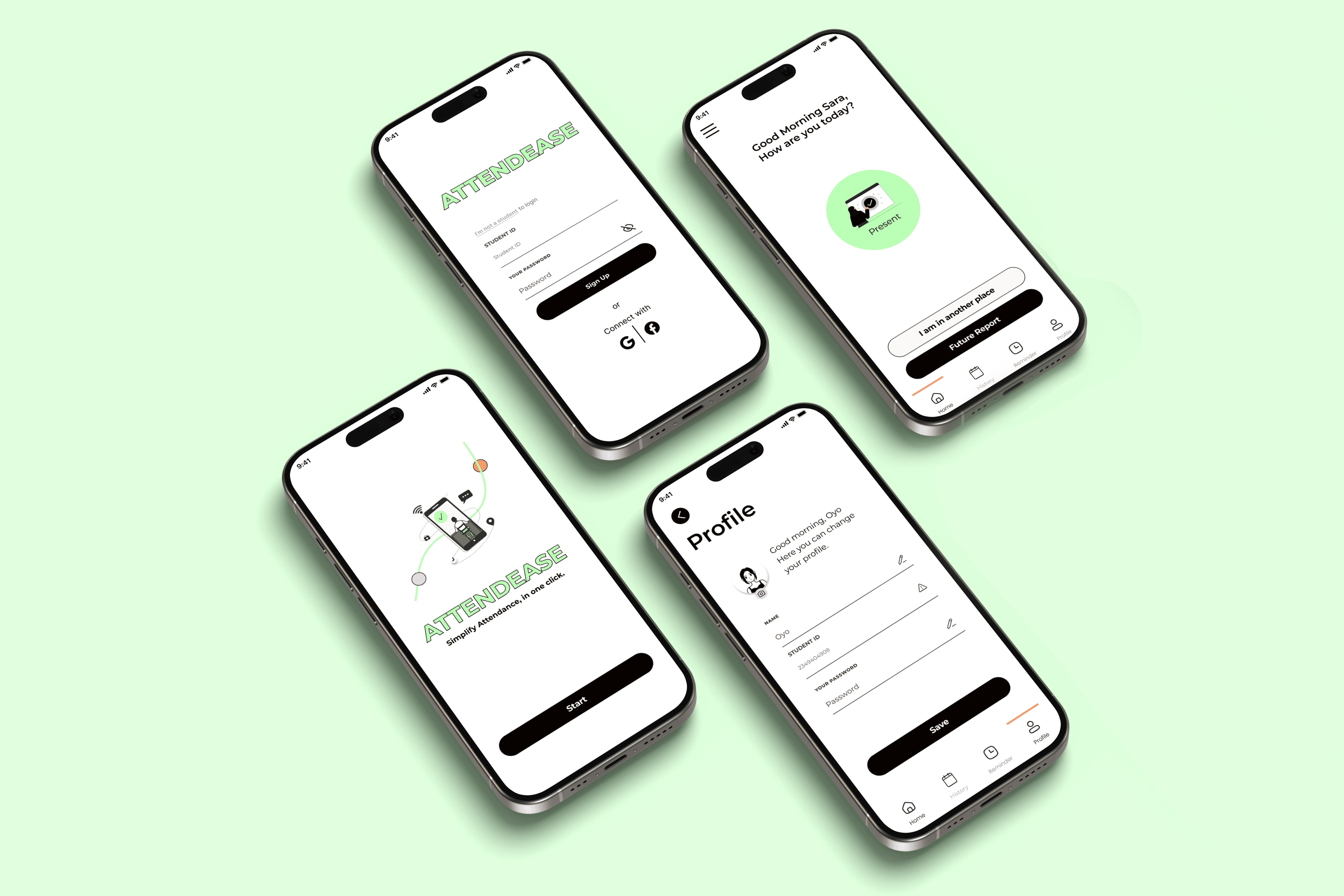
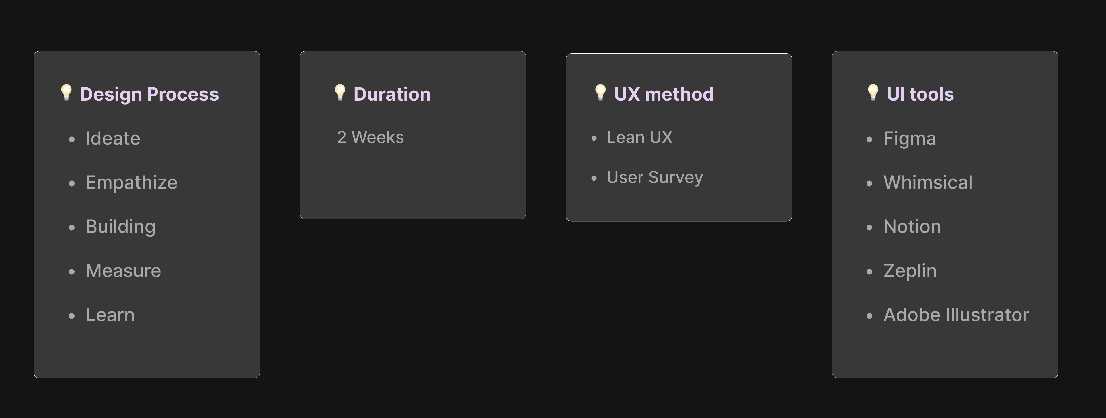
Ditched the complicated attendance applications and created an simple attendance monitoring application to help teachers and students. October, 2023
What is Attendease?
OVERVIEW
Attendance check application for students and teachers.
This app allows full control of personnel in a school. Through proper reporting of attendance, there is follow-up by the teacher and the school on the treatment of the students: Online, sick leave, appointments, utilization of vacation days allowed for each student and more.
In addition to reporting on your condition that day, you can attach references and forms required for the teacher - such as a document from a doctor's visit, a special leave certificate, and more.
🧠 Ideate
Background
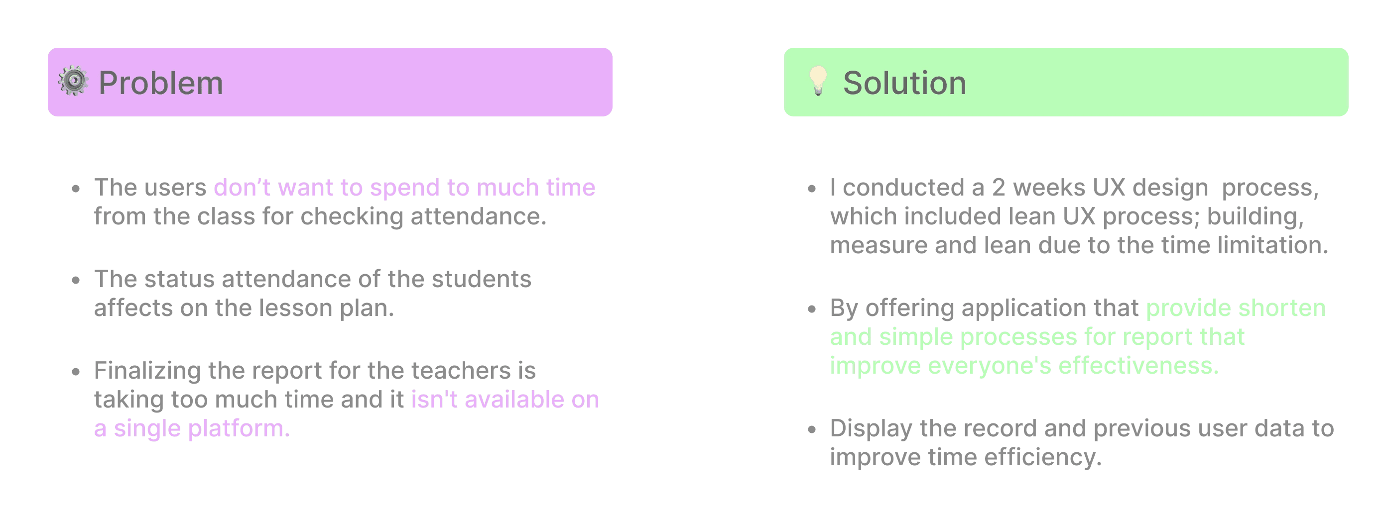
As students who have studied on various platforms, we observed that the current method of taking attendance at the start of a lesson wastes time and impacts the lesson's effectiveness. We aimed to solve this issue.

KNOW MORE ABOUT THE USER
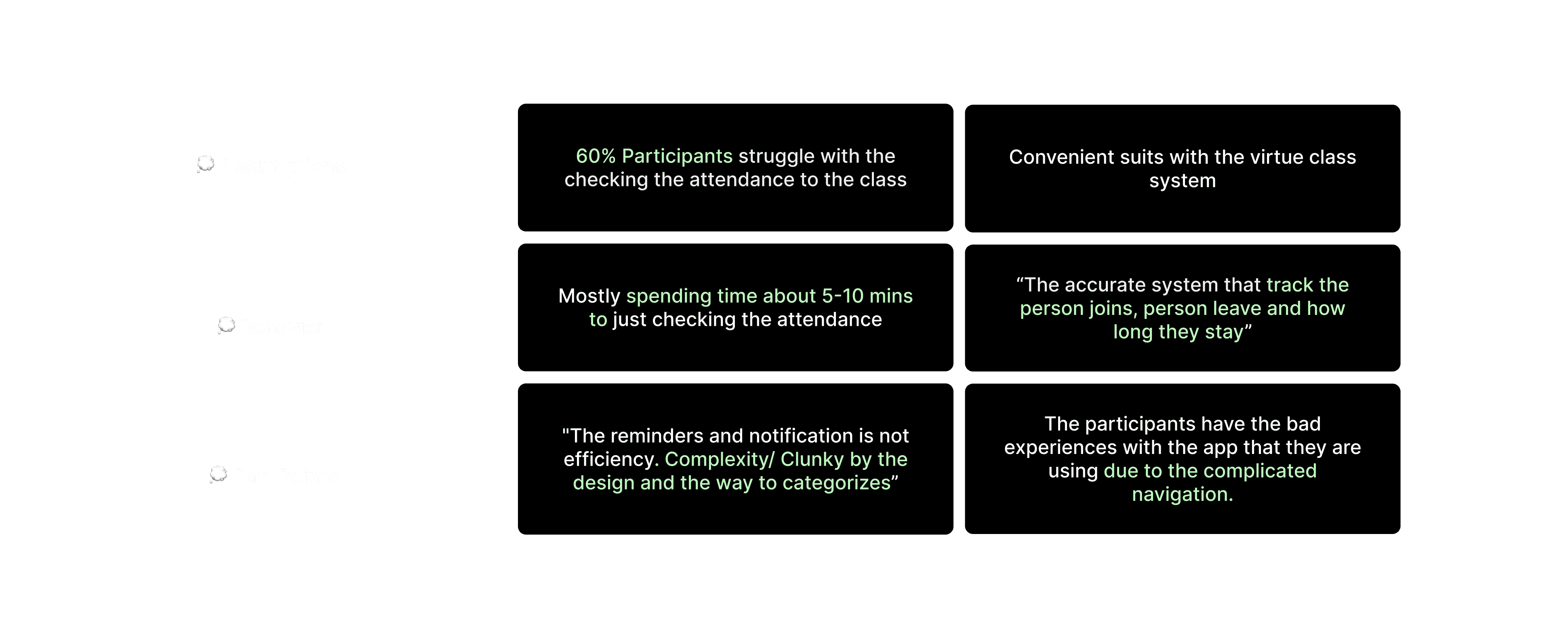
Research into some pain point to correctly identify the problem and confirm our assumptions, we conducted a survey among the experienced student and teacher.
15 people were interviewed: Both are Teacher/Student users that are experienced with checking attendance application before.
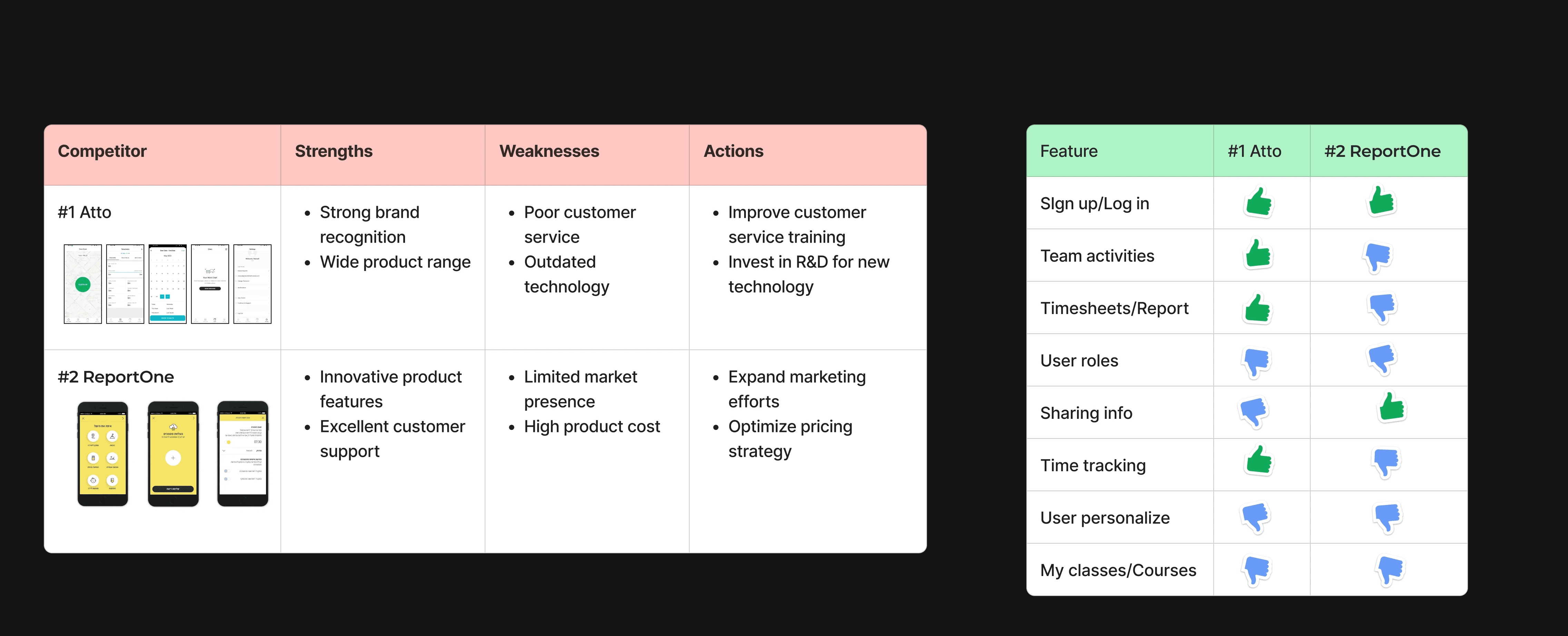
Competitive Research
For this part of the project, I chose to explore top-rated schedule management apps, compare their key features, and identify the problems they address.

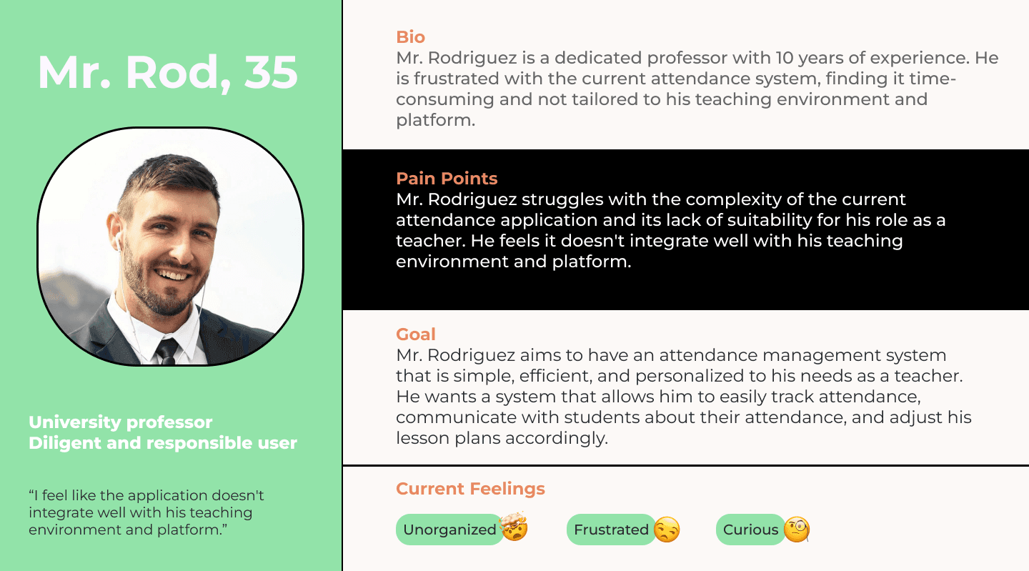
OUR POTENTIAL USERS,
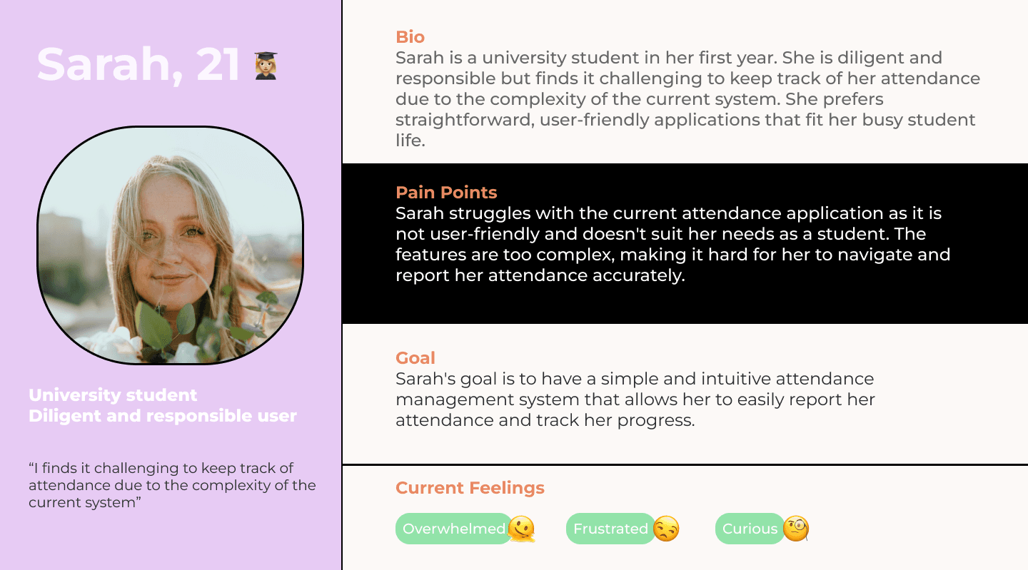
Creating a 2 persona(s) are to accurately represent our targeted users due to the research outcomes. This allowed us to represents the main user goals and frustration.
#1 Mr. Rodriguez, the professor
#2 SARAH, the university student
⚙️Empathize
Prioritization
Identify the Feature mapping
Having pinpointed the solution that would provide the greatest value to my users, I proceeded to explore and brainstorm ideas for the app's features. The research phase equipped me with the information needed to differentiate between features that would offer low vs high value to the user.

User Flow
After prioritizing the essential features for my initial idea, I identified two user flows and These 2 user flows assume the user is using the app for the first time:
#Task 1: The teacher is obtaining the class report.
(Click right to enlarge the image in new tab)

#Task 2: Record the attendance accurately as a student.
(Click right to enlarge the image in new tab)

App Navigation
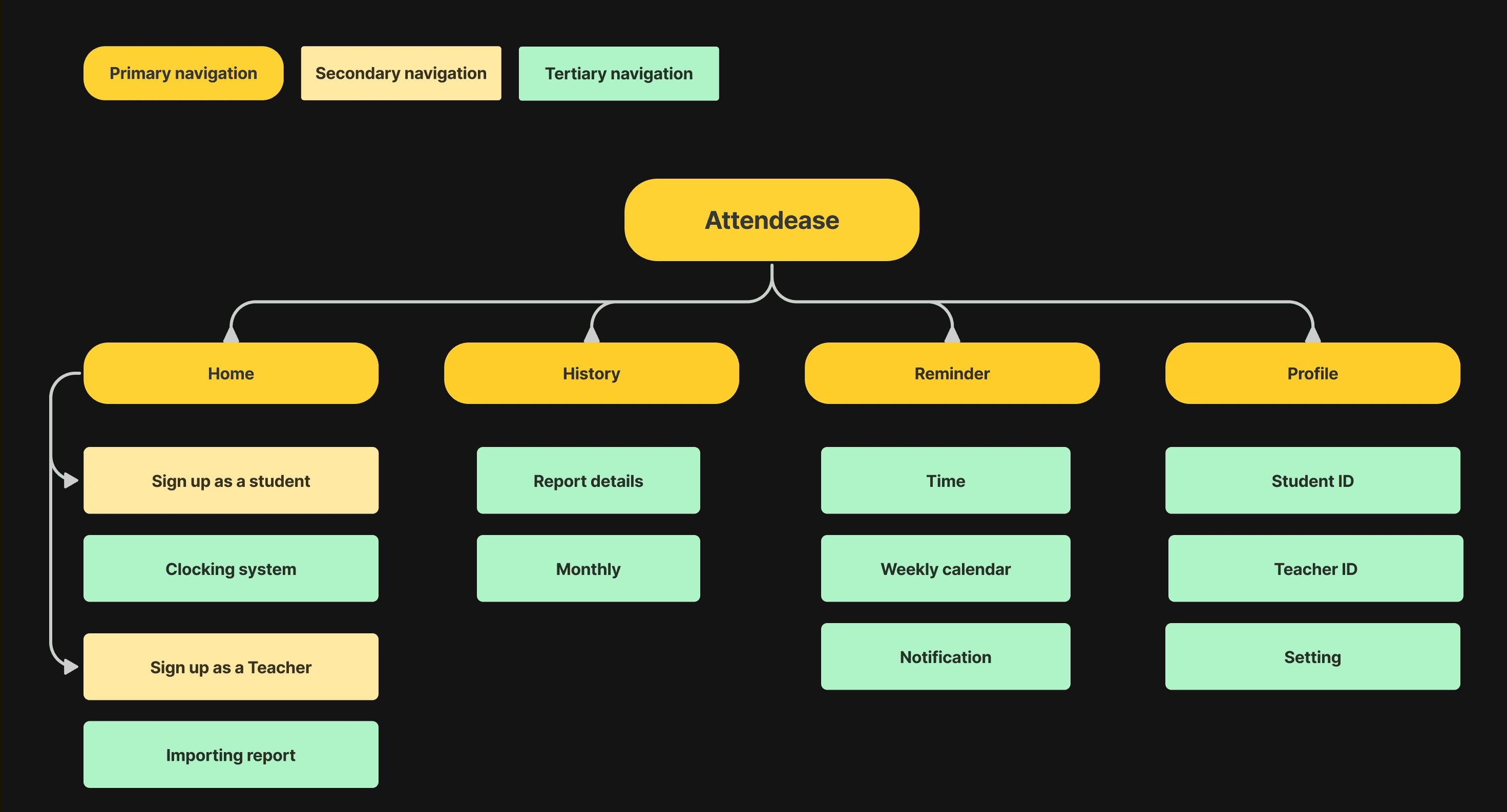
We have create the easiest information architecture solution based on the user flow and feature roadmap which main actions users might have taken: Home, History, Reminder and Profile.
Make the idea(s) to Initial Testing
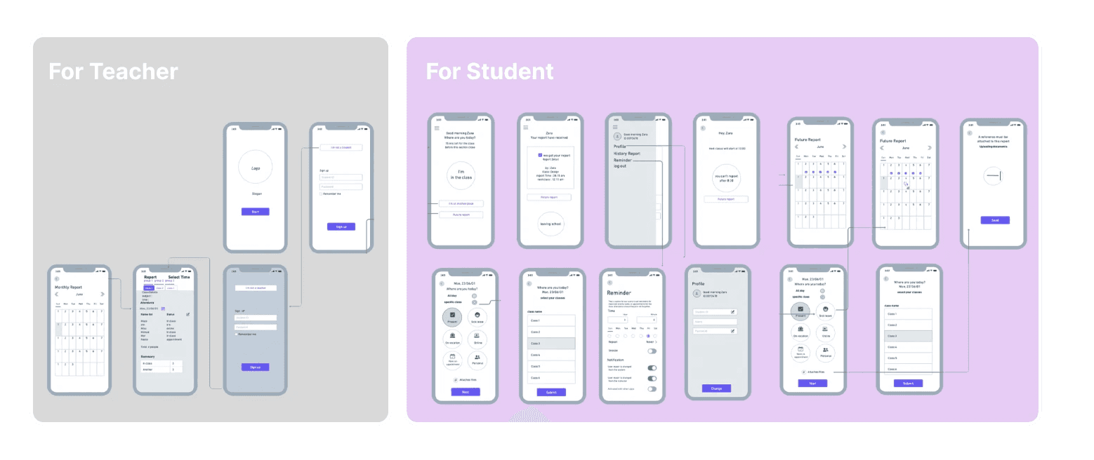
The lo-fi wireframes enabled us to conduct the initial usability tests and identify the key revisions that require immediate implementation.
The mid-fi version below includes iterations made mainly to the information flow, feature and microcopy for instance:
⚙️ Building
Introducing Attendease
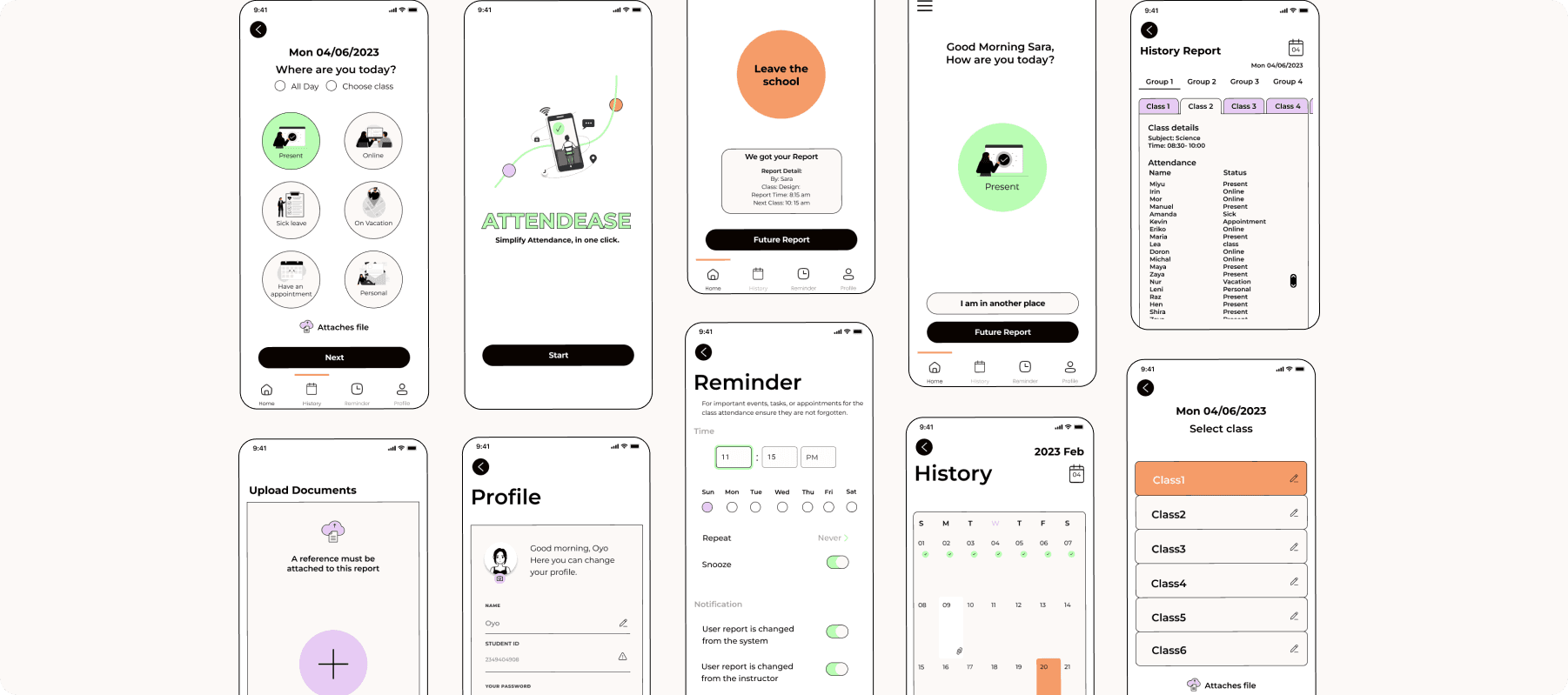
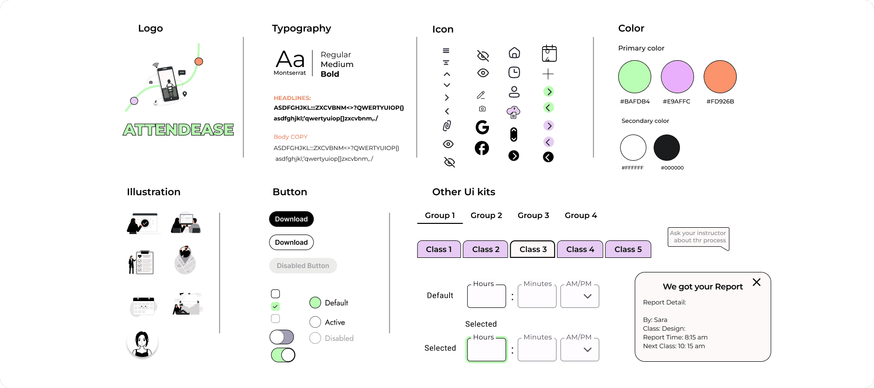
We created the UI kit that reflects the brand goal. As the name of the app is Attendease, it helps user attend to class and access the report effortlessly.
The prototype
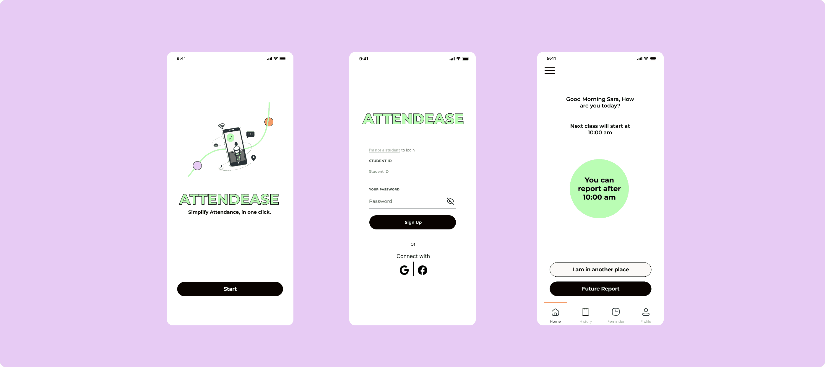
📍Flow 1 : The login impression. Makes it easy
To direct the target users towards their specific tasks, we have created two separate onboarding interfaces. One is for professors or teachers
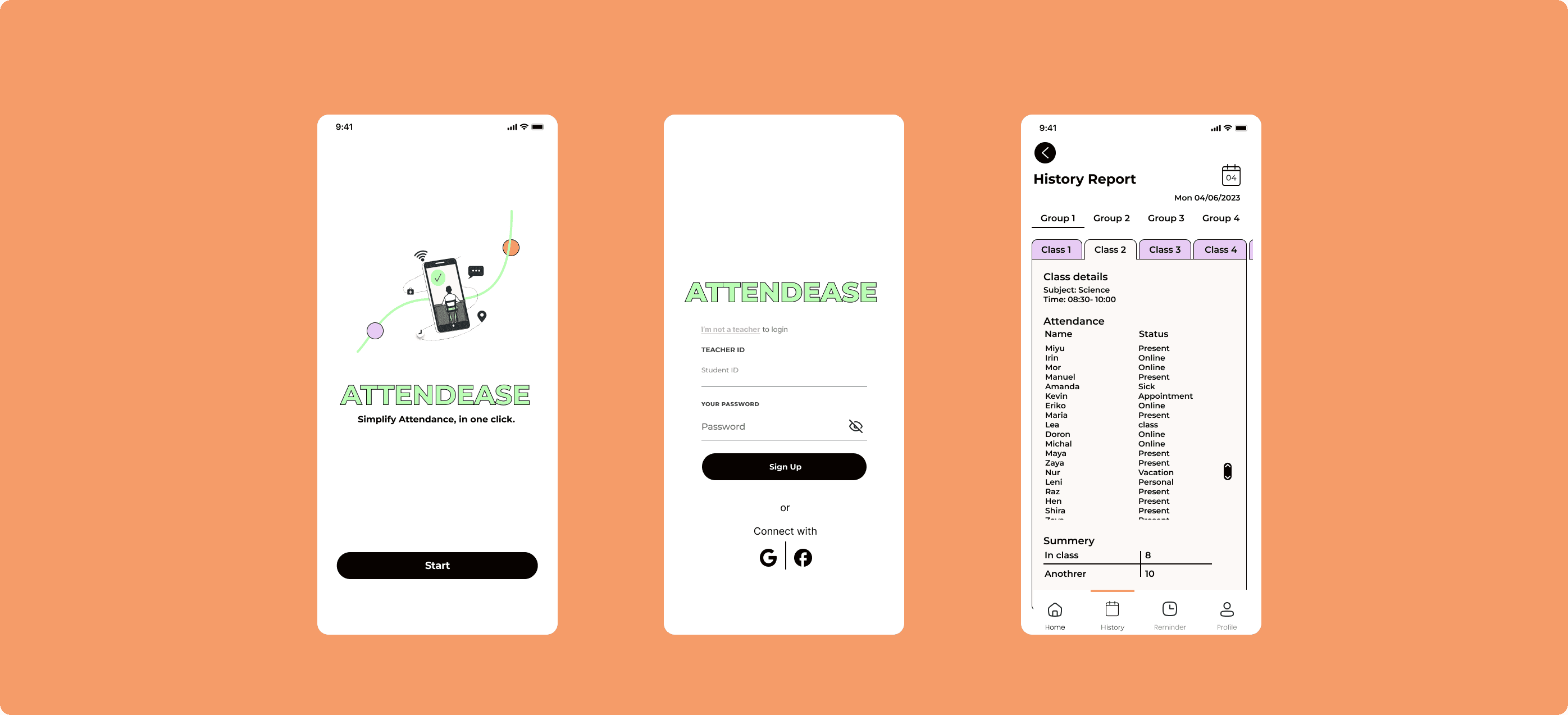
and the another is for students.
👨🏻🏫 For Teacher📍Flow 2 : Make the process more time-efficient
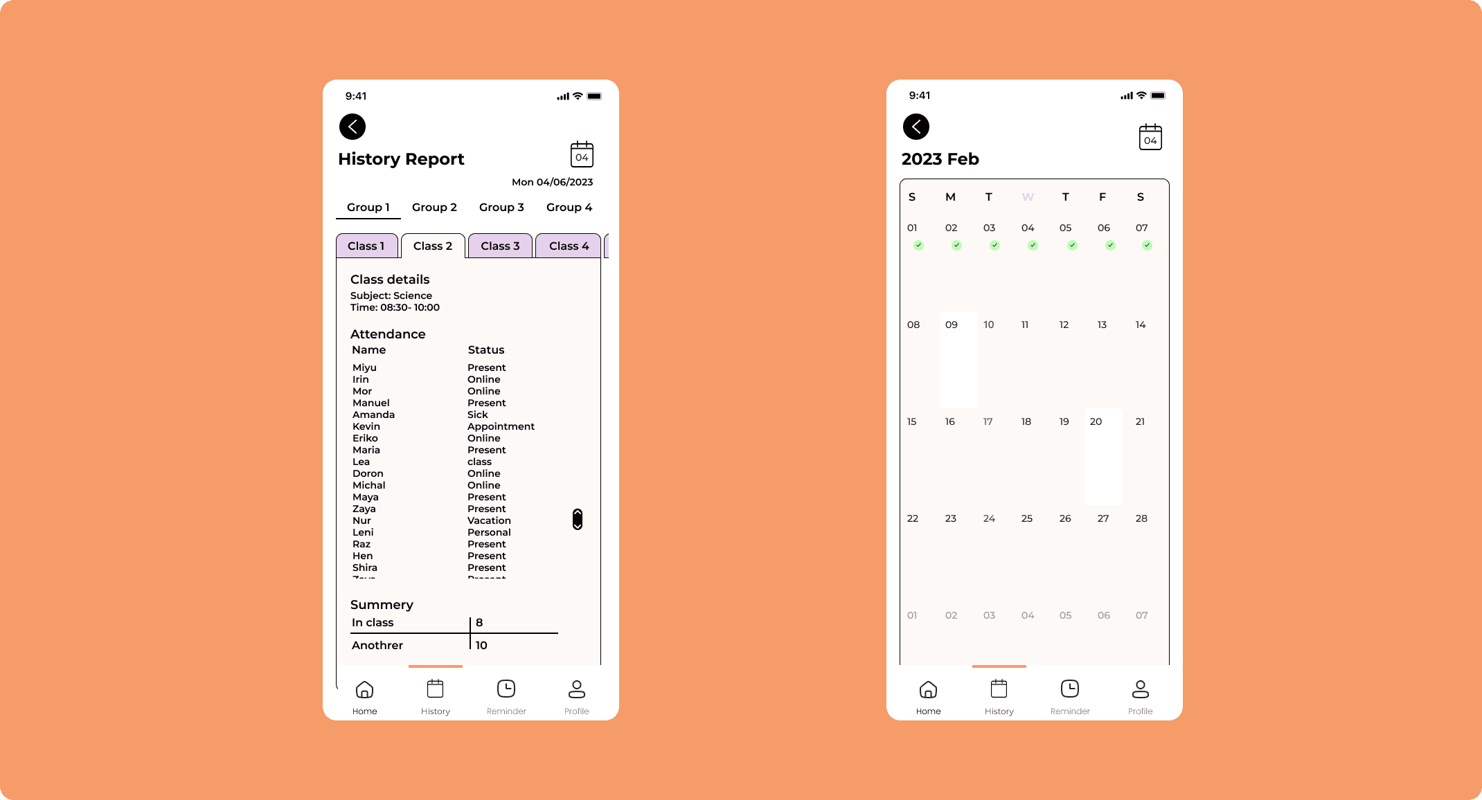
Enables teachers to monitor and follow up on accurate attendance reporting.
👩🏻🎓 For Student📍Flow 3: Check attendance in real-time and personalize your attendance tracking
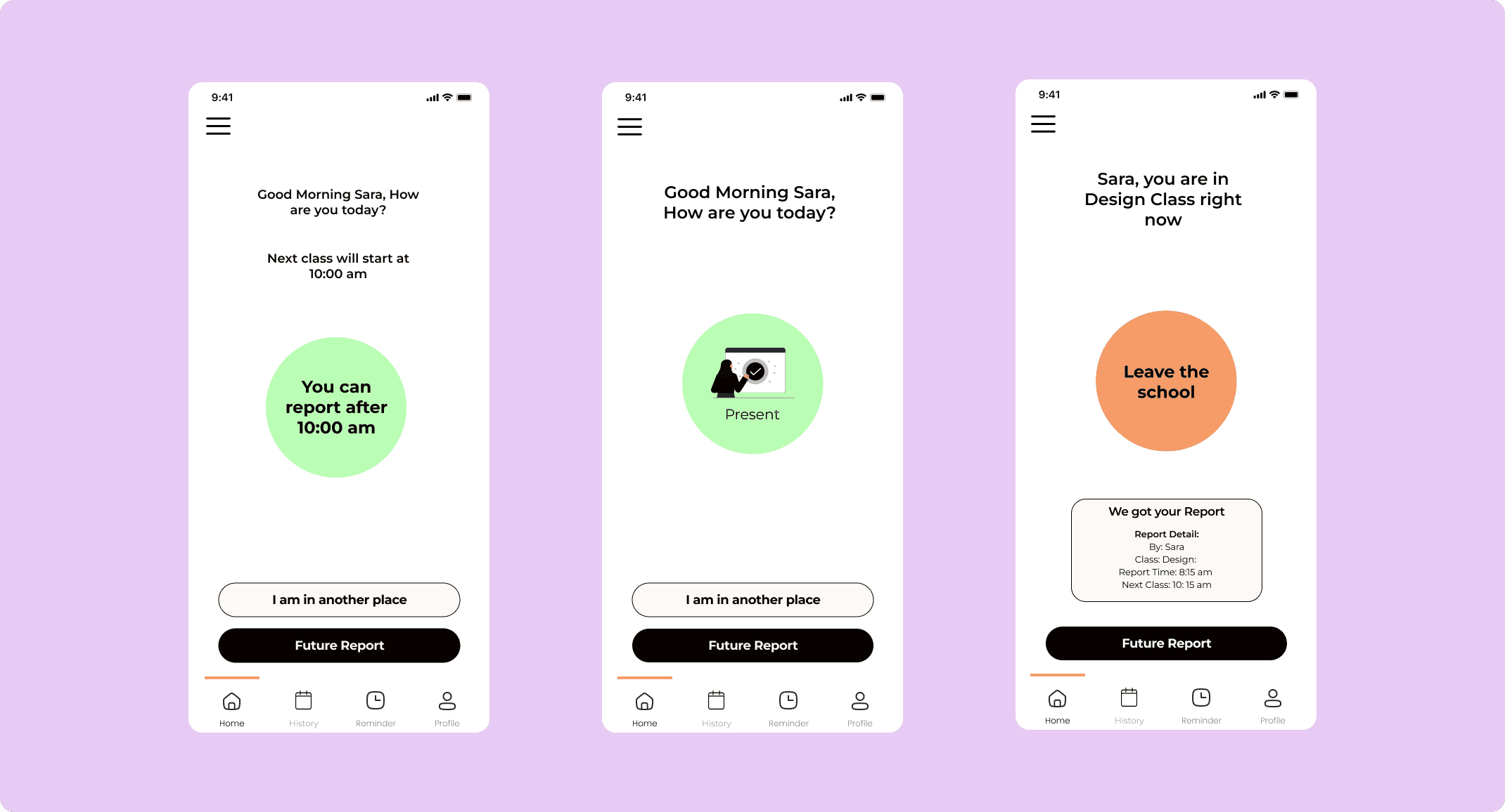
Enhance the timer to record the attendance to the report
Based on the class you are in, wherever and whenever you are, the attendance checking is just a single tap on your screen.
📍Flow 4 : Choose your own factors
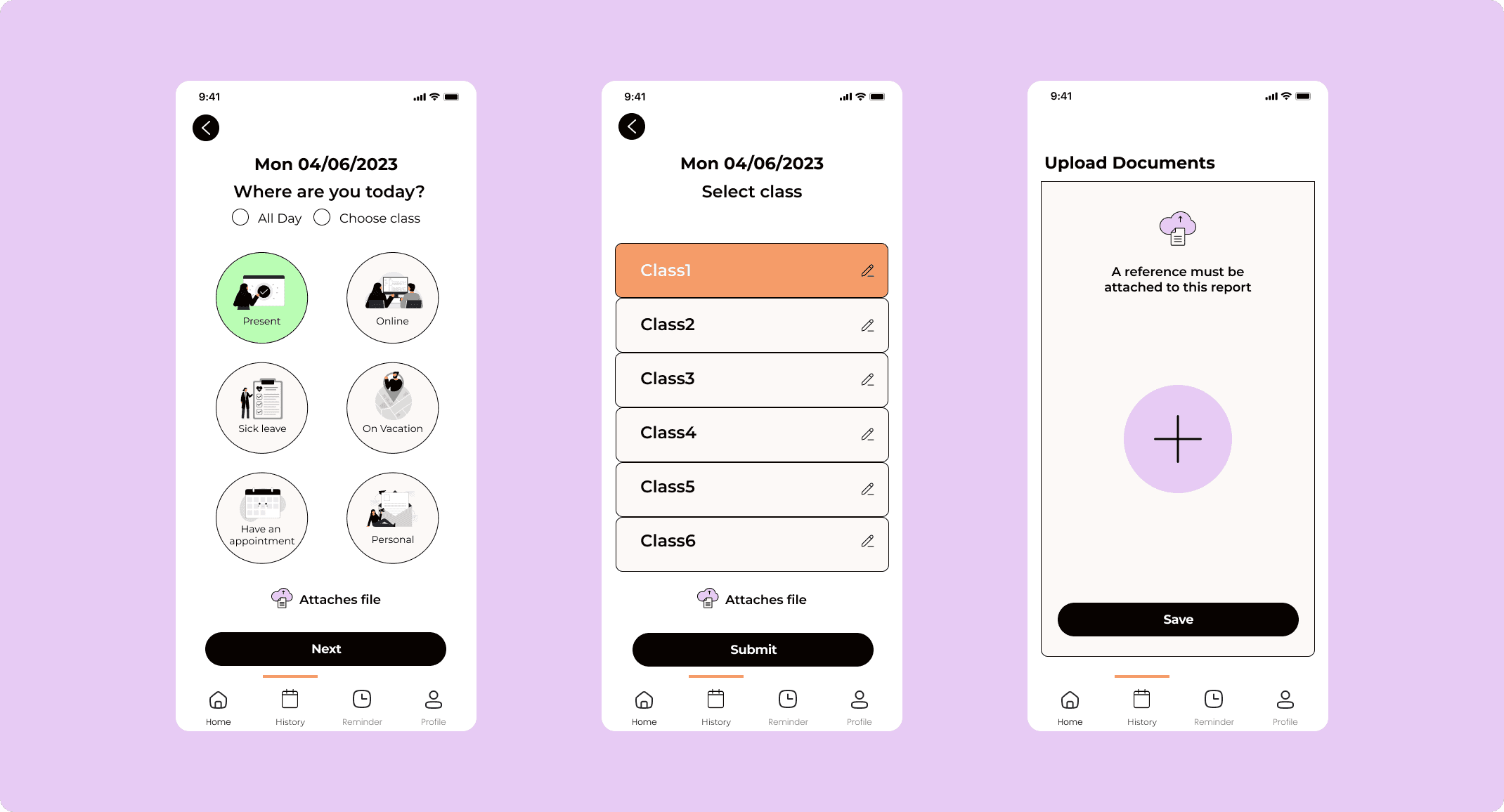
In response to lo-fi testing, we're developing a call to action button for user personalization, allowing users to select factors for valid absences or document uploads.
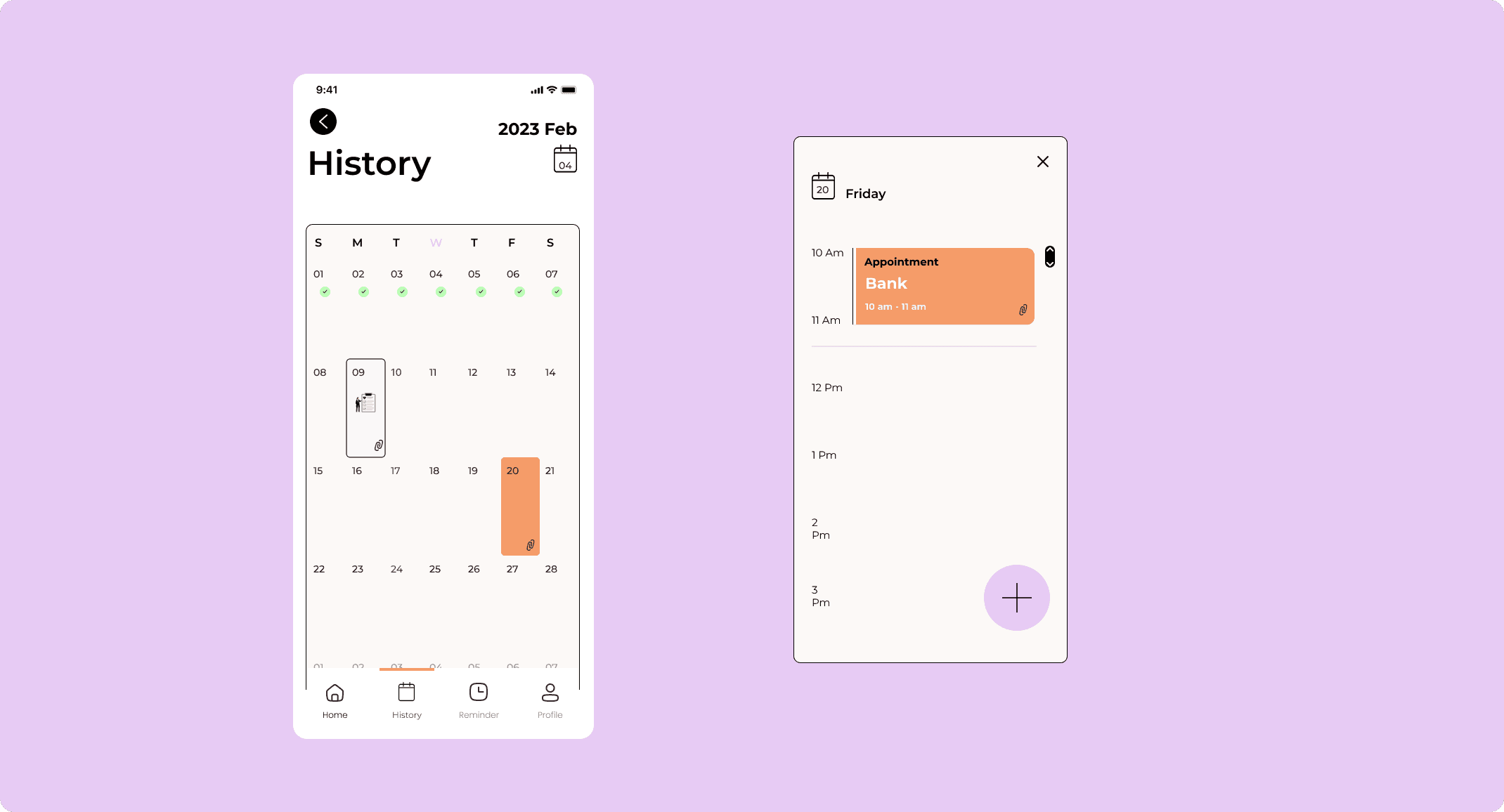
📍Flow 5: Look back in the class and history
The history report is displayed as a calendar, making it easy for users to find and review existing documents or previous report approvals, as they are already familiar with this interface.
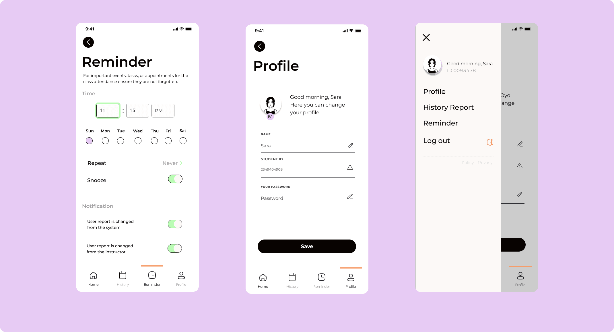
📍Other flow: Notification and Profile
📏 Measure
Usability Testing
We have got the Insights gathered from user feedback:
100% of test users provided a rating of 9 out of 10 of usability of the app from both student and teacher users.
Average time from start to finished the task dropped from 25s to 18s.
85% understood the new navigation icons
Some feedback I received:

Long-term iterations
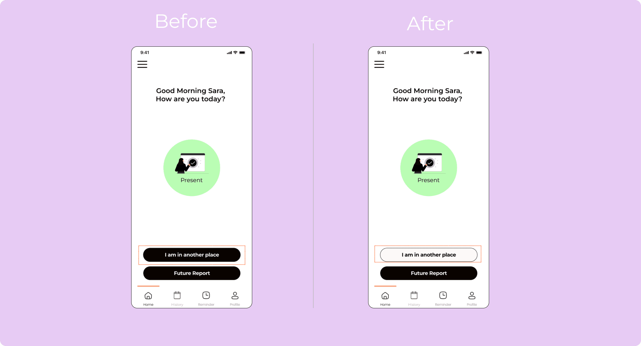
Flow 3: Check attendance in real-time and personalize your attendance tracking
After we tested the design, they felt that it will be clear and easiest for the user to distinguish between the buttons and their role by make them in different colors.
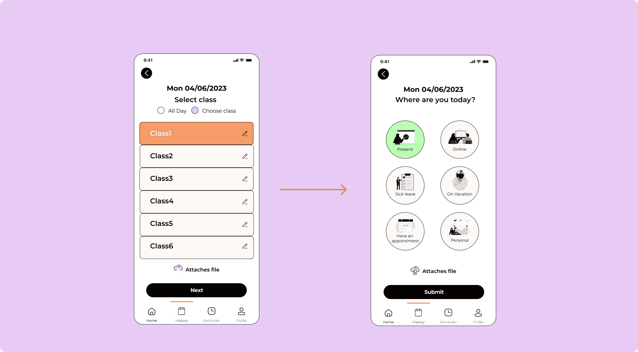
Flow 4 : During testing, 80% of test users mistakenly selected "all day" instead of choosing a specific class, as the interface for both options was the same.
In response, we implemented clearer navigation by prioritizing, first showing the classes page for selection, followed by the personalized content.
THE DEMO: Try the full Prototype

🔑 Learn
This project gave me a more profound insight into the design process. Initially, our goal was to create innovative ideas that had never been fixed in the existing application.
However, I quickly learned that originality is not the only important factor. While unique concepts are valuable, similar results can be achieved by adjusting the process. Improving user experience is still crucial. Having two main target users can be confusing during the process.
In future work, separating the functions into different frameworks can lead to a deeper understanding of each user's needs and more efficient outcomes.
Connect with me
Let's create together ✨
Read my UX case study article, Click to see my Notion
Attendease
Ditched the complicated attendance applications and created an simple attendance monitoring application to help teachers and students. October, 2023


What is Attendease?
OVERVIEW
Attendance check application for students and teachers.
This app allows full control of personnel in a school. Through proper reporting of attendance, there is follow-up by the teacher and the school on the treatment of the students: Online, sick leave, appointments, utilization of vacation days allowed for each student and more.
In addition to reporting on your condition that day, you can attach references and forms required for the teacher - such as a document from a doctor's visit, a special leave certificate, and more.


🧠 Ideate
Background
As students who have studied on various platforms, we observed that the current method of taking attendance at the start of a lesson wastes time and impacts the lesson's effectiveness. We aimed to solve this issue.

KNOW MORE ABOUT THE USER
Research into some pain point to correctly identify the problem and confirm our assumptions, we conducted a survey among the experienced student and teacher.
15 people were interviewed: Both are Teacher/Student users that are experienced with checking attendance application before.

Competitive Research
For this part of the project, I chose to explore top-rated schedule management apps, compare their key features, and identify the problems they address.


OUR POTENTIAL USERS,
Creating a 2 persona(s) are to accurately represent our targeted users due to the research outcomes. This allowed us to represents the main user goals and frustration.
#1 Mr. Rodriguez, the professor

#2 SARAH, the university student

⚙️Empathize
Prioritization
Identify the Feature mapping
Having pinpointed the solution that would provide the greatest value to my users, I proceeded to explore and brainstorm ideas for the app's features. The research phase equipped me with the information needed to differentiate between features that would offer low vs high value to the user.

User Flow
After prioritizing the essential features for my initial idea, I identified two user flows and These 2 user flows assume the user is using the app for the first time:
#Task 1: The teacher is obtaining the class report.
(Click right to enlarge the image in new tab)

#Task 2: Record the attendance accurately as a student.
(Click right to enlarge the image in new tab)

App Navigation
We have create the easiest information architecture solution based on the user flow and feature roadmap which main actions users might have taken: Home, History, Reminder and Profile.

Make the idea(s) to Initial Testing
The lo-fi wireframes enabled us to conduct the initial usability tests and identify the key revisions that require immediate implementation.
The mid-fi version below includes iterations made mainly to the information flow, feature and microcopy for instance:

⚙️ Building
Introducing Attendease
We created the UI kit that reflects the brand goal. As the name of the app is Attendease, it helps user attend to class and access the report effortlessly.

The prototype
📍Flow 1 : The login impression. Makes it easy
To direct the target users towards their specific tasks, we have created two separate onboarding interfaces. One is for professors or teachers

and the another is for students.

👨🏻🏫 For Teacher📍Flow 2 : Make the process more time-efficient
Enables teachers to monitor and follow up on accurate attendance reporting.

👩🏻🎓 For Student📍Flow 3: Check attendance in real-time and personalize your attendance tracking
Enhance the timer to record the attendance to the report
Based on the class you are in, wherever and whenever you are, the attendance checking is just a single tap on your screen.

📍Flow 4 : Choose your own factors
In response to lo-fi testing, we're developing a call to action button for user personalization, allowing users to select factors for valid absences or document uploads.

📍Flow 5: Look back in the class and history
The history report is displayed as a calendar, making it easy for users to find and review existing documents or previous report approvals, as they are already familiar with this interface.

📍Other flow: Notification and Profile

📏 Measure
Usability Testing
We have got the Insights gathered from user feedback:
100% of test users provided a rating of 9 out of 10 of usability of the app from both student and teacher users.
Average time from start to finished the task dropped from 25s to 18s.
85% understood the new navigation icons
Some feedback I received:

Long-term iterations
Flow 3: Check attendance in real-time and personalize your attendance tracking
After we tested the design, they felt that it will be clear and easiest for the user to distinguish between the buttons and their role by make them in different colors.

Flow 4 : During testing, 80% of test users mistakenly selected "all day" instead of choosing a specific class, as the interface for both options was the same.
In response, we implemented clearer navigation by prioritizing, first showing the classes page for selection, followed by the personalized content.

THE DEMO: Try the full Prototype

🔑 Learn
This project gave me a more profound insight into the design process. Initially, our goal was to create innovative ideas that had never been fixed in the existing application.
However, I quickly learned that originality is not the only important factor. While unique concepts are valuable, similar results can be achieved by adjusting the process. Improving user experience is still crucial. Having two main target users can be confusing during the process.
In future work, separating the functions into different frameworks can lead to a deeper understanding of each user's needs and more efficient outcomes.
Connect with me
Let's create together ✨
Read my UX case study article, Click to see my Notion
Attendease
Ditched the complicated attendance applications and created an simple attendance monitoring application to help teachers and students. October, 2023


What is Attendease?
OVERVIEW
Attendance check application for students and teachers.
This app allows full control of personnel in a school. Through proper reporting of attendance, there is follow-up by the teacher and the school on the treatment of the students: Online, sick leave, appointments, utilization of vacation days allowed for each student and more.
In addition to reporting on your condition that day, you can attach references and forms required for the teacher - such as a document from a doctor's visit, a special leave certificate, and more.


🧠 Ideate
Background
As students who have studied on various platforms, we observed that the current method of taking attendance at the start of a lesson wastes time and impacts the lesson's effectiveness. We aimed to solve this issue.

KNOW MORE ABOUT THE USER
Research into some pain point to correctly identify the problem and confirm our assumptions, we conducted a survey among the experienced student and teacher.
15 people were interviewed: Both are Teacher/Student users that are experienced with checking attendance application before.

Competitive Research
For this part of the project, I chose to explore top-rated schedule management apps, compare their key features, and identify the problems they address.


OUR POTENTIAL USERS,
Creating a 2 persona(s) are to accurately represent our targeted users due to the research outcomes. This allowed us to represents the main user goals and frustration.
#1 Mr. Rodriguez, the professor

#2 SARAH, the university student

⚙️Empathize
Prioritization
Identify the Feature mapping
Having pinpointed the solution that would provide the greatest value to my users, I proceeded to explore and brainstorm ideas for the app's features. The research phase equipped me with the information needed to differentiate between features that would offer low vs high value to the user.

User Flow
After prioritizing the essential features for my initial idea, I identified two user flows and These 2 user flows assume the user is using the app for the first time:
#Task 1: The teacher is obtaining the class report.
(Click right to enlarge the image in new tab)

#Task 2: Record the attendance accurately as a student.
(Click right to enlarge the image in new tab)

App Navigation
We have create the easiest information architecture solution based on the user flow and feature roadmap which main actions users might have taken: Home, History, Reminder and Profile.

Make the idea(s) to Initial Testing
The lo-fi wireframes enabled us to conduct the initial usability tests and identify the key revisions that require immediate implementation.
The mid-fi version below includes iterations made mainly to the information flow, feature and microcopy for instance:

⚙️ Building
Introducing Attendease
We created the UI kit that reflects the brand goal. As the name of the app is Attendease, it helps user attend to class and access the report effortlessly.

The prototype
📍Flow 1 : The login impression. Makes it easy
To direct the target users towards their specific tasks, we have created two separate onboarding interfaces. One is for professors or teachers

and the another is for students.

👨🏻🏫 For Teacher📍Flow 2 : Make the process more time-efficient
Enables teachers to monitor and follow up on accurate attendance reporting.

👩🏻🎓 For Student📍Flow 3: Check attendance in real-time and personalize your attendance tracking
Enhance the timer to record the attendance to the report
Based on the class you are in, wherever and whenever you are, the attendance checking is just a single tap on your screen.

📍Flow 4 : Choose your own factors
In response to lo-fi testing, we're developing a call to action button for user personalization, allowing users to select factors for valid absences or document uploads.

📍Flow 5: Look back in the class and history
The history report is displayed as a calendar, making it easy for users to find and review existing documents or previous report approvals, as they are already familiar with this interface.

📍Other flow: Notification and Profile

📏 Measure
Usability Testing
We have got the Insights gathered from user feedback:
100% of test users provided a rating of 9 out of 10 of usability of the app from both student and teacher users.
Average time from start to finished the task dropped from 25s to 18s.
85% understood the new navigation icons
Some feedback I received:

Long-term iterations
Flow 3: Check attendance in real-time and personalize your attendance tracking
After we tested the design, they felt that it will be clear and easiest for the user to distinguish between the buttons and their role by make them in different colors.

Flow 4 : During testing, 80% of test users mistakenly selected "all day" instead of choosing a specific class, as the interface for both options was the same.
In response, we implemented clearer navigation by prioritizing, first showing the classes page for selection, followed by the personalized content.

THE DEMO: Try the full Prototype

🔑 Learn
This project gave me a more profound insight into the design process. Initially, our goal was to create innovative ideas that had never been fixed in the existing application.
However, I quickly learned that originality is not the only important factor. While unique concepts are valuable, similar results can be achieved by adjusting the process. Improving user experience is still crucial. Having two main target users can be confusing during the process.
In future work, separating the functions into different frameworks can lead to a deeper understanding of each user's needs and more efficient outcomes.
Connect with me
Let's create together ✨
Read my UX case study article, Click to see my Notion