ODDR Lawfirm
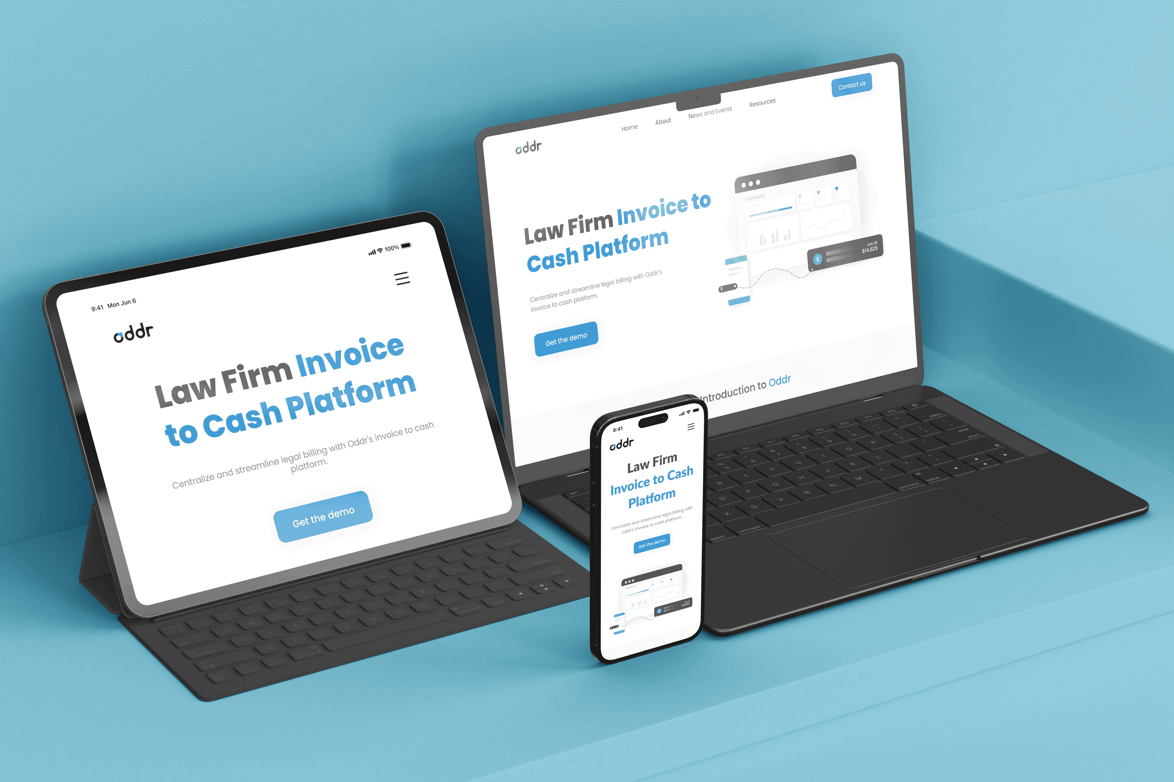
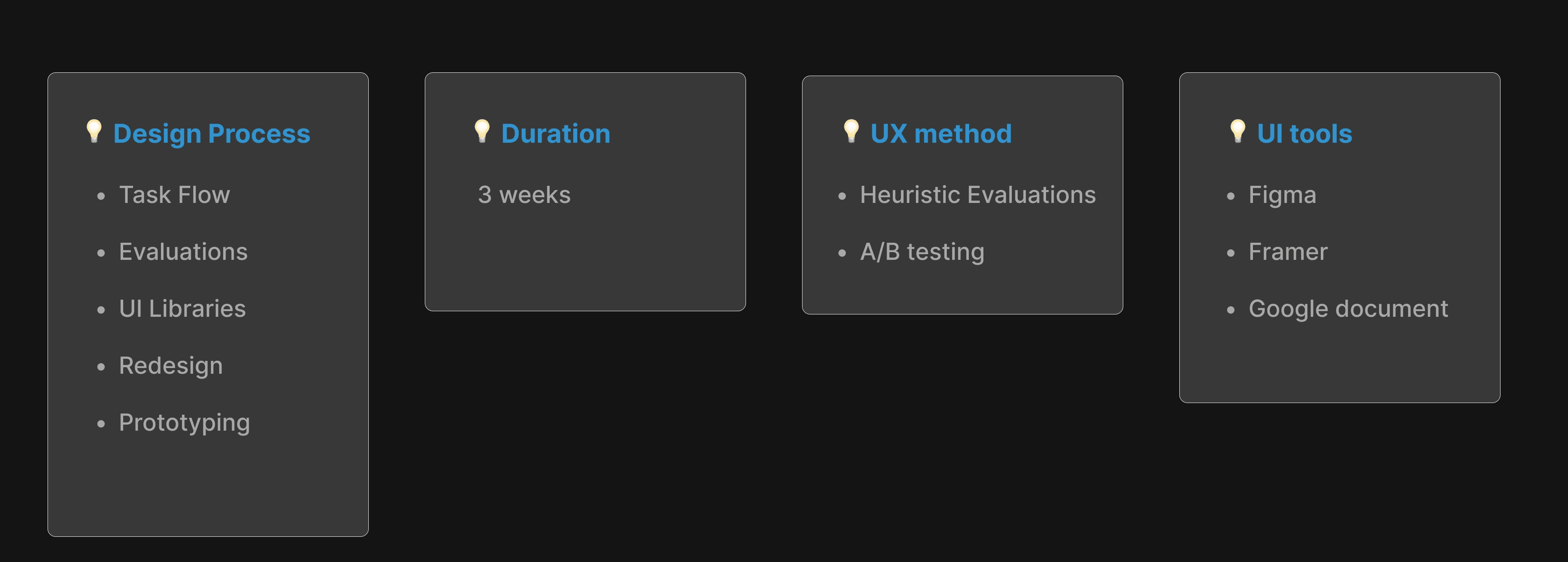
Redesigned a SaaS website for a lawfirms invoice-to-cash management, aimed to make it a user friendly experience. August, 2023
The client
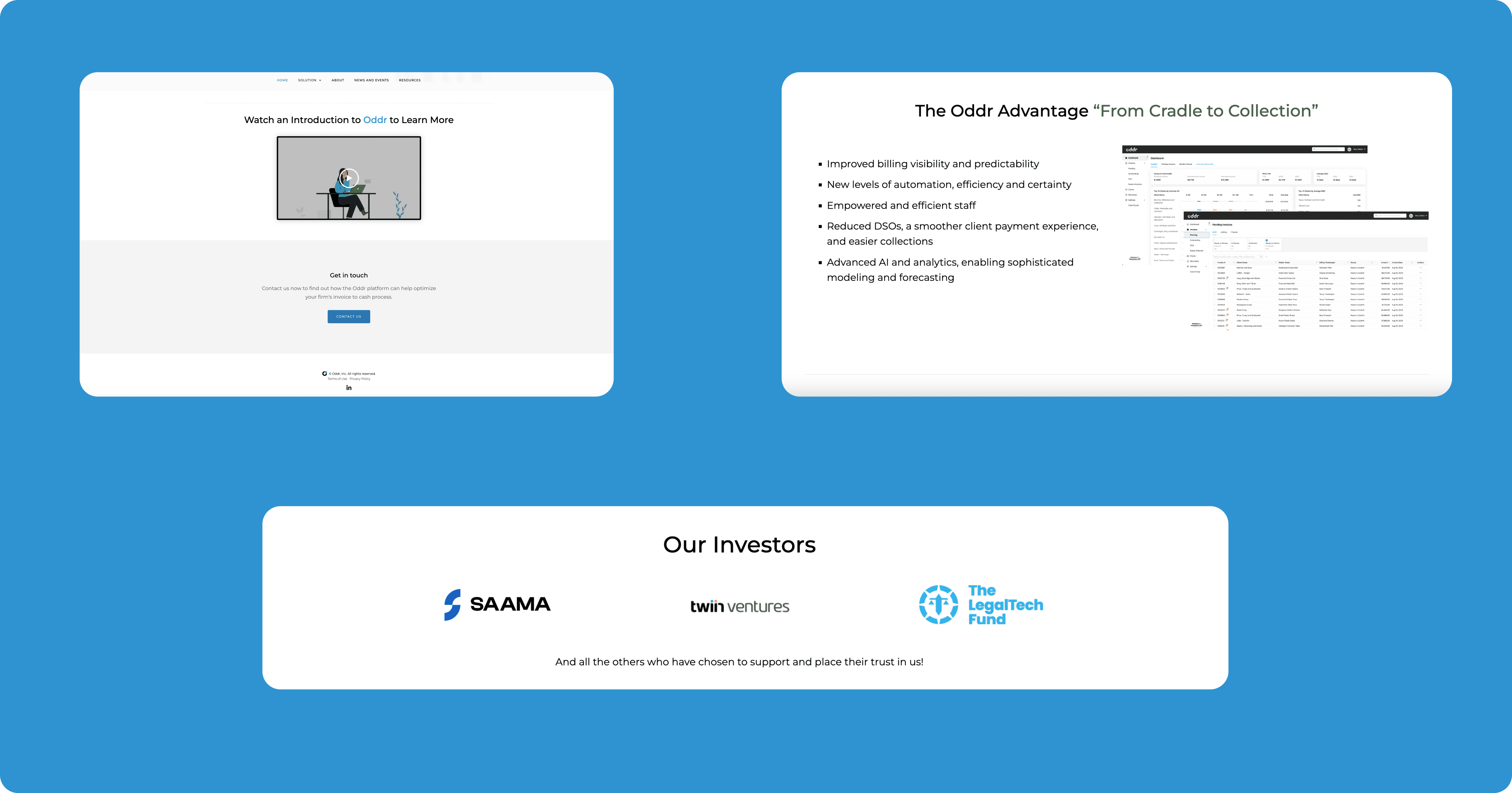
Oddr is an innovative business that pioneers the invoice-to-cash management platform known as SaaS (Software as a Service) website, aiming to revolutionize how law firms handle their invoicing process. Their mission is to centralize, streamline, and accelerate every aspect of invoicing, from bill creation and delivery to collections and reconciliation.
It's time to start !
New Simple makeover and enhance website usability, we assume that the website should say everything about your business and promote all your current products, services, and pricing. It should attract prospects and answer any and all questions they have about the company.
As a designers,

Design Challenges
Responsive Design - Our team came up with the idea to make the differentiation.
Diverse Screen Sizes and Devices With an ever-expanding range of devices, from smartphones and tablets to laptops and desktops, ensuring that the website looks and functions well on all screen sizes is the primary challenge for our team.
Things to Consider
The client has specified two key limitations and constraints for us to consider while following the brand guidelines: the existing logo and color scheme. Additionally, they have requested that we focus solely on redesigning the website visually, without altering any other aspects of the context.

🧪 Solutions
Heuristic Evaluation research
To diagnose these issues, we needed to perform a heuristic evaluation on the product. During this evaluation, "How might we" questions came up in our thoughts:

By identifying the usability in the existing website, we assessed each instance on a severity scale ranging from 1-5 to extent of the problems. We listed the complete set of usability problems that have been discovered by our team, and we asked the 10 participates to rate the severity of each problem and described in reasonable depth.

The Offenders
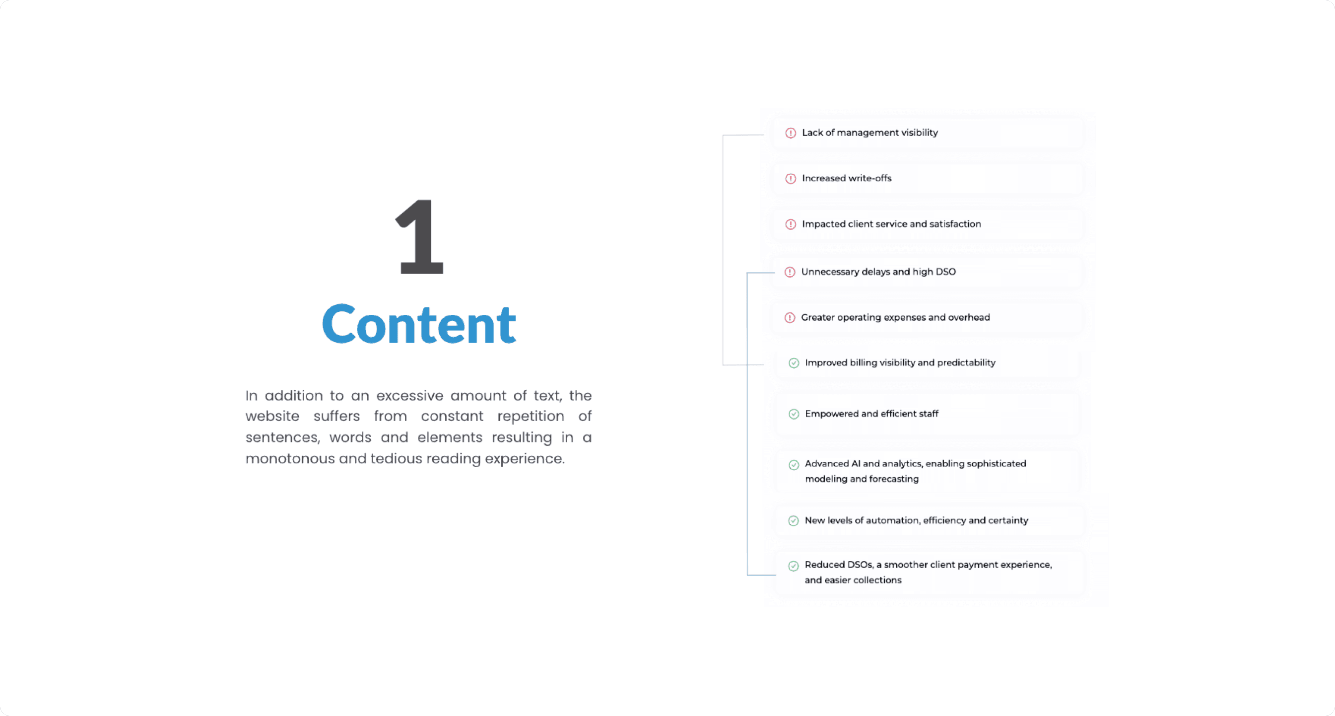
⚙️ Content
Heuristic violated: Flexibility and Efficiency of Use
Severity Rating: 5
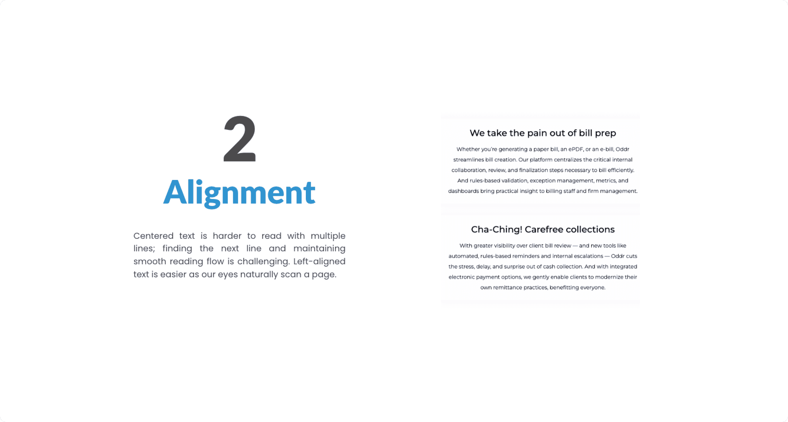
⚙️ Alignment
Heuristic violated: Aesthetic and minimalist design
Severity Rating: 2
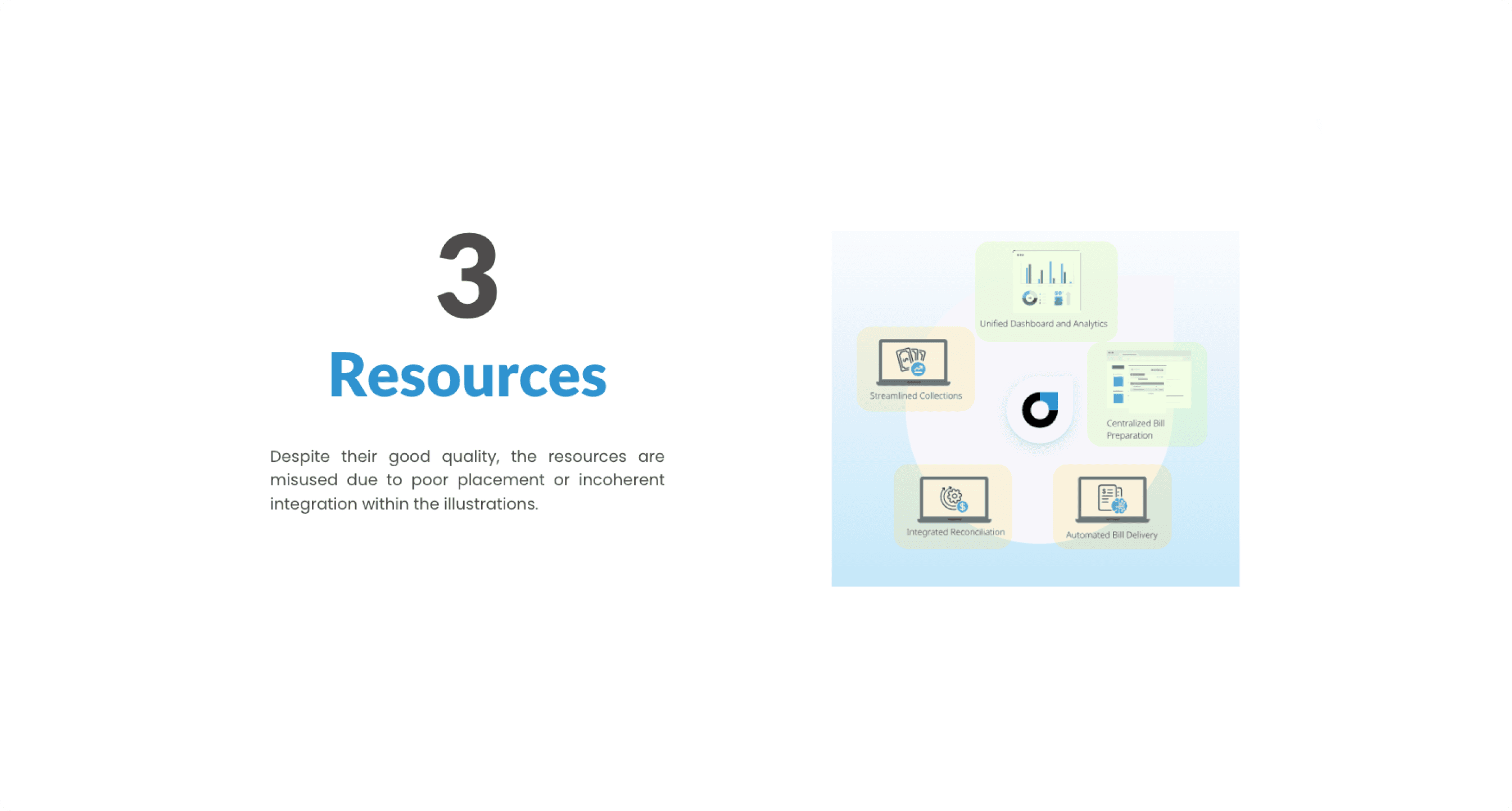
⚙️ Resources
Heuristic violated: Consistency and standards
Severity Rating: 4
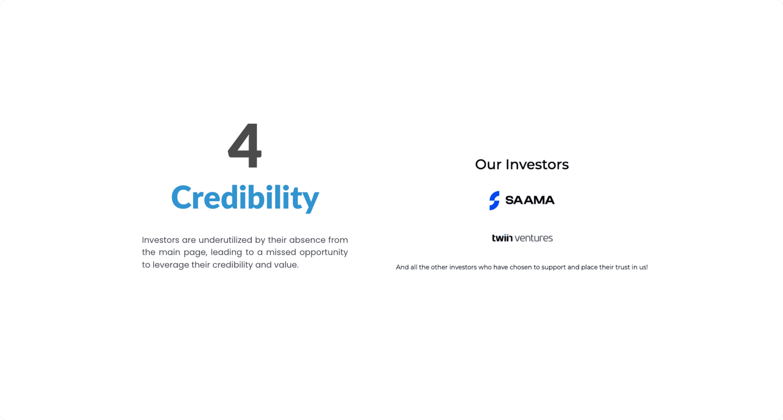
⚙️ Credibility
Heuristic violated: Recognition rather than recall
Severity Rating: 2
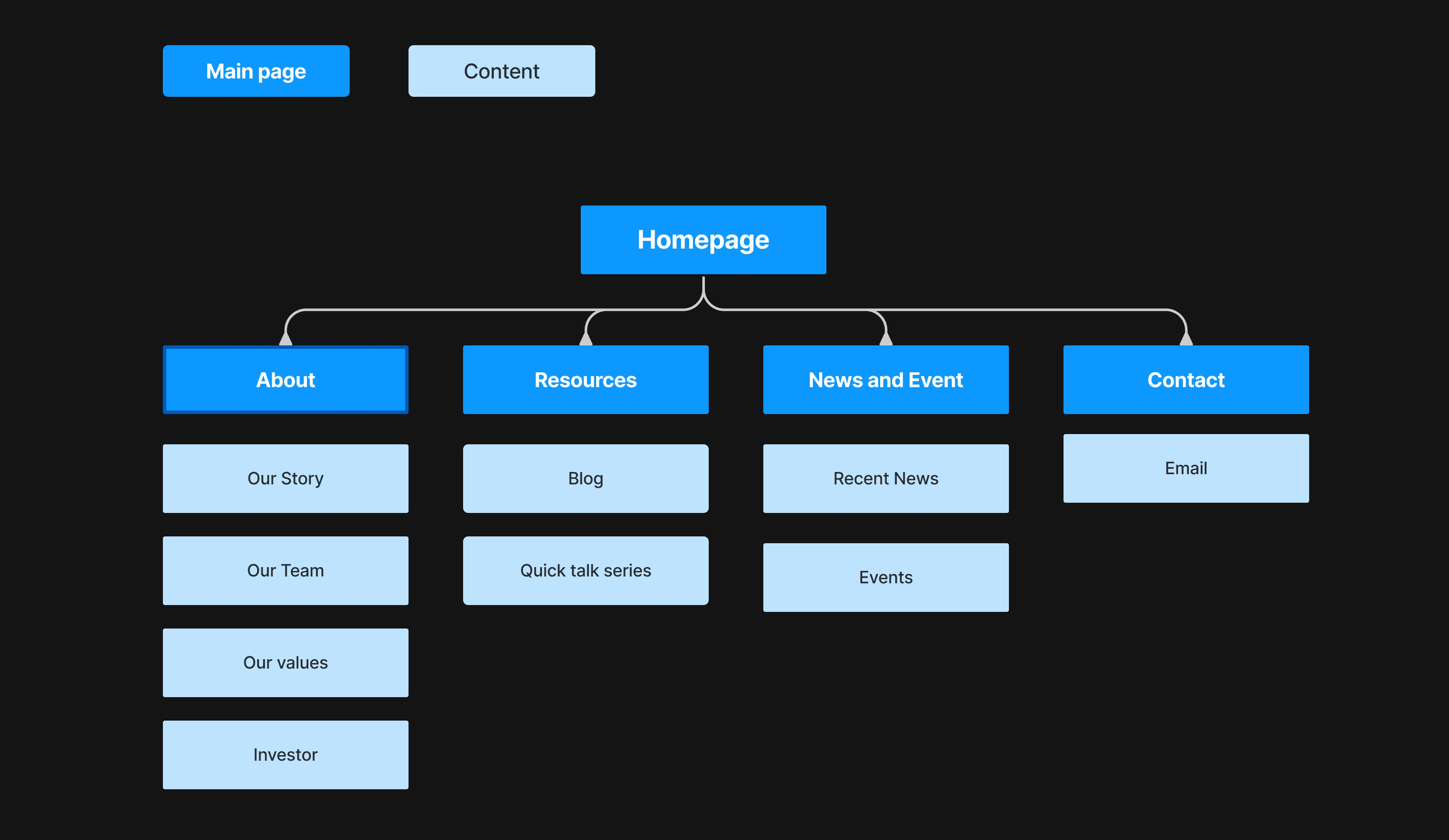
Guide the user with "easier" App Navigation
After we analyzed the existing content, we have create the easiest information architecture solution.
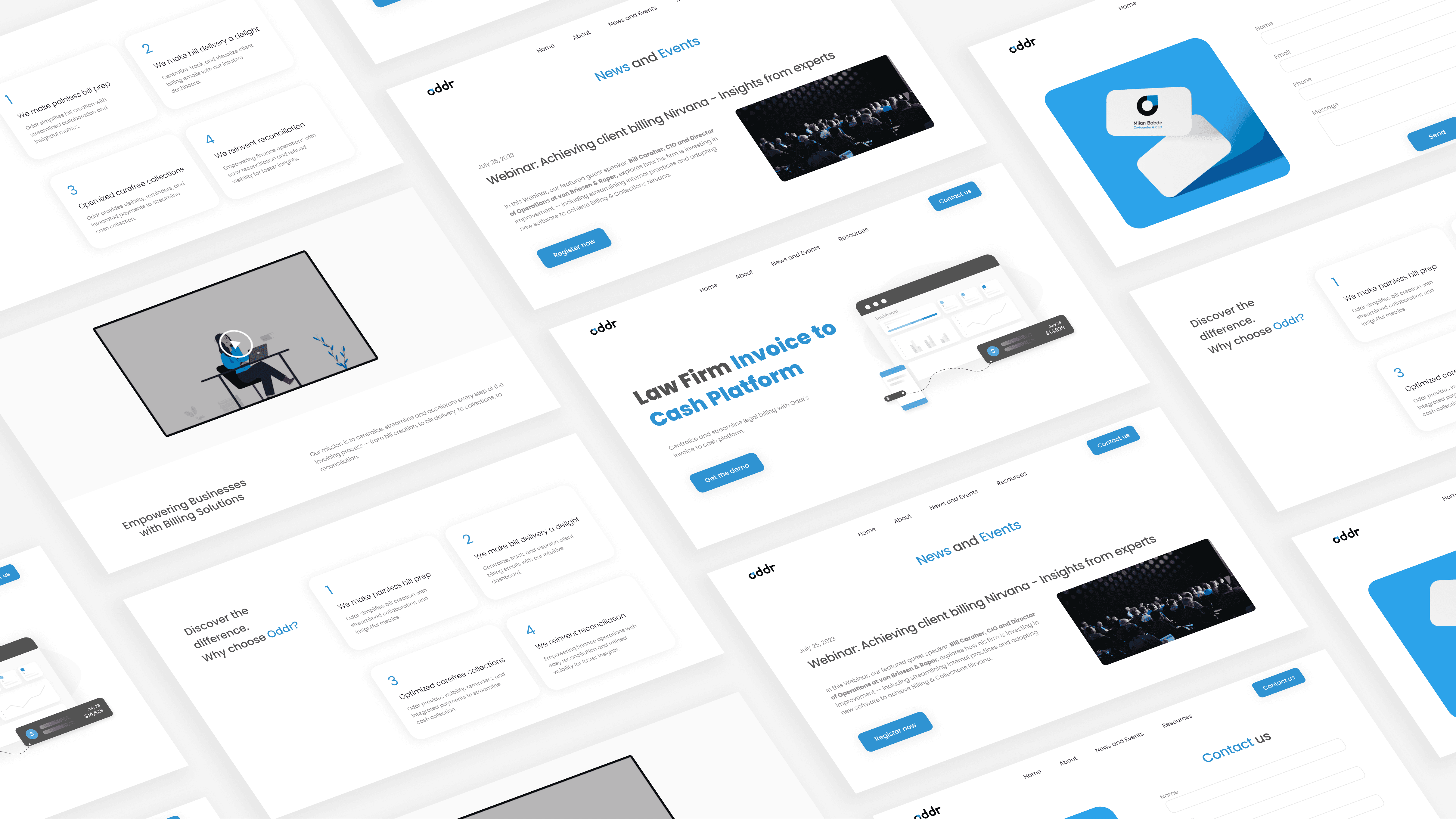
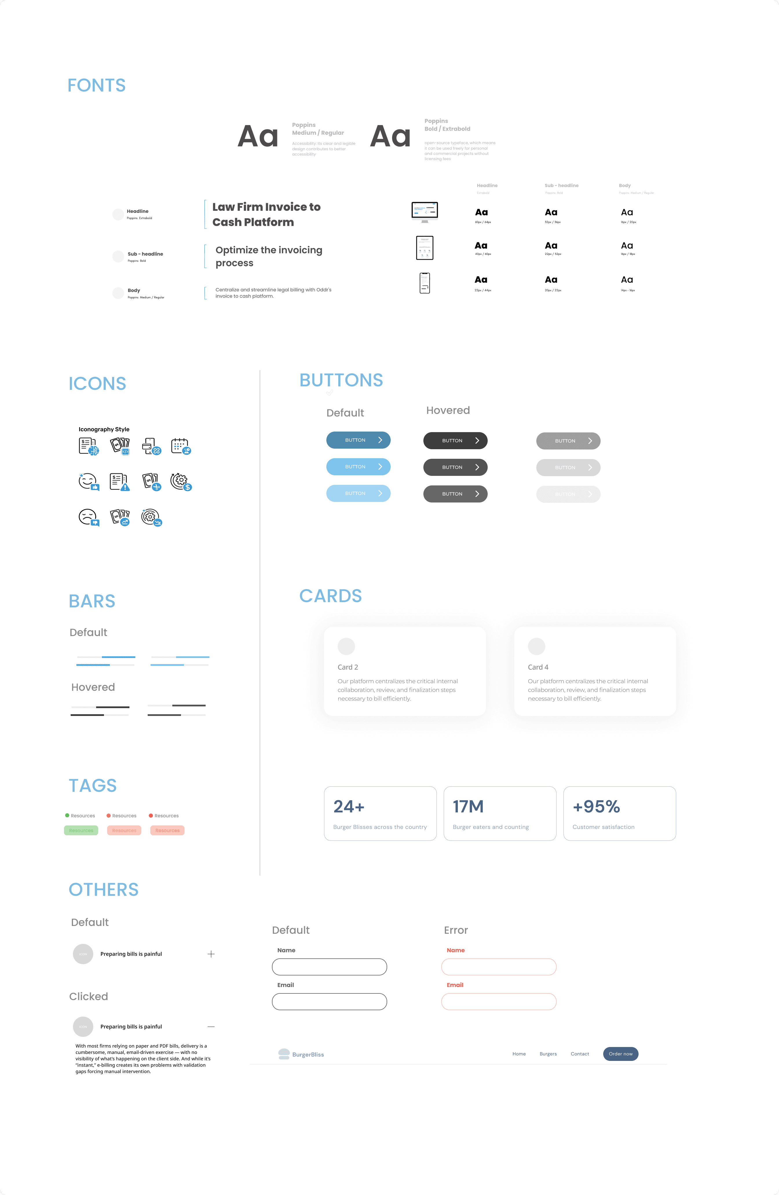
Introducing the Oddr redesign UI kits
Low fi wireframe: Initial idea
The next step in my process was creating a low fidelity wireframes. Before settling on a more final version I used to reimagine, I explored a couple of options using different styles and reducing unnecessary elements from the existing Oddr website and played with the new front design as well.
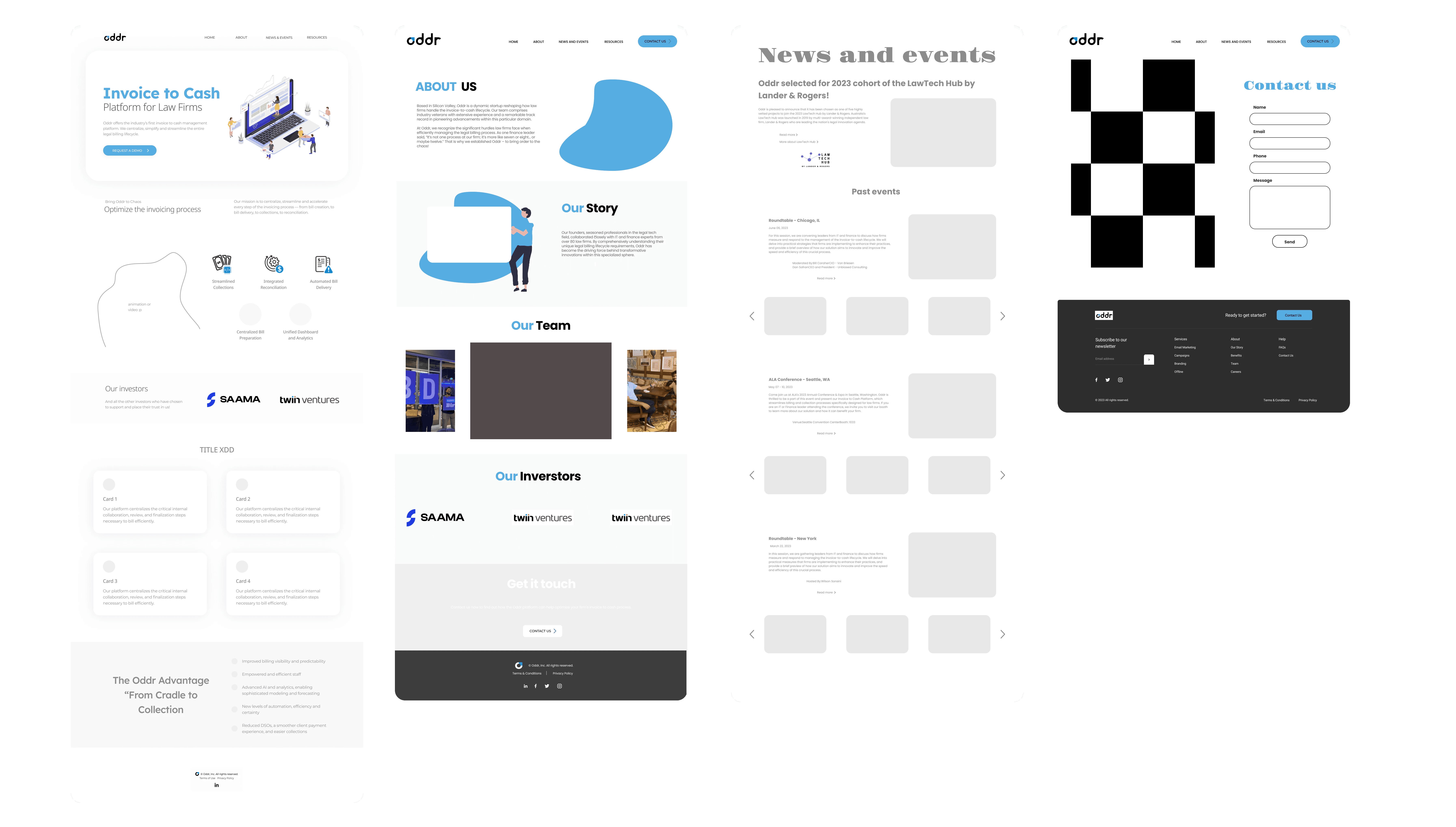
After completing the initial wireframe for Oddr’s website, we undertook a redesign of a collection of responsive screens focused on their usability flow. This redesign was guided by a Heuristic Evaluation to enhance user usability.
We ensure that each screen not only aligns perfectly with established usability principles but also provides a seamless, intuitive user experience across all device types.
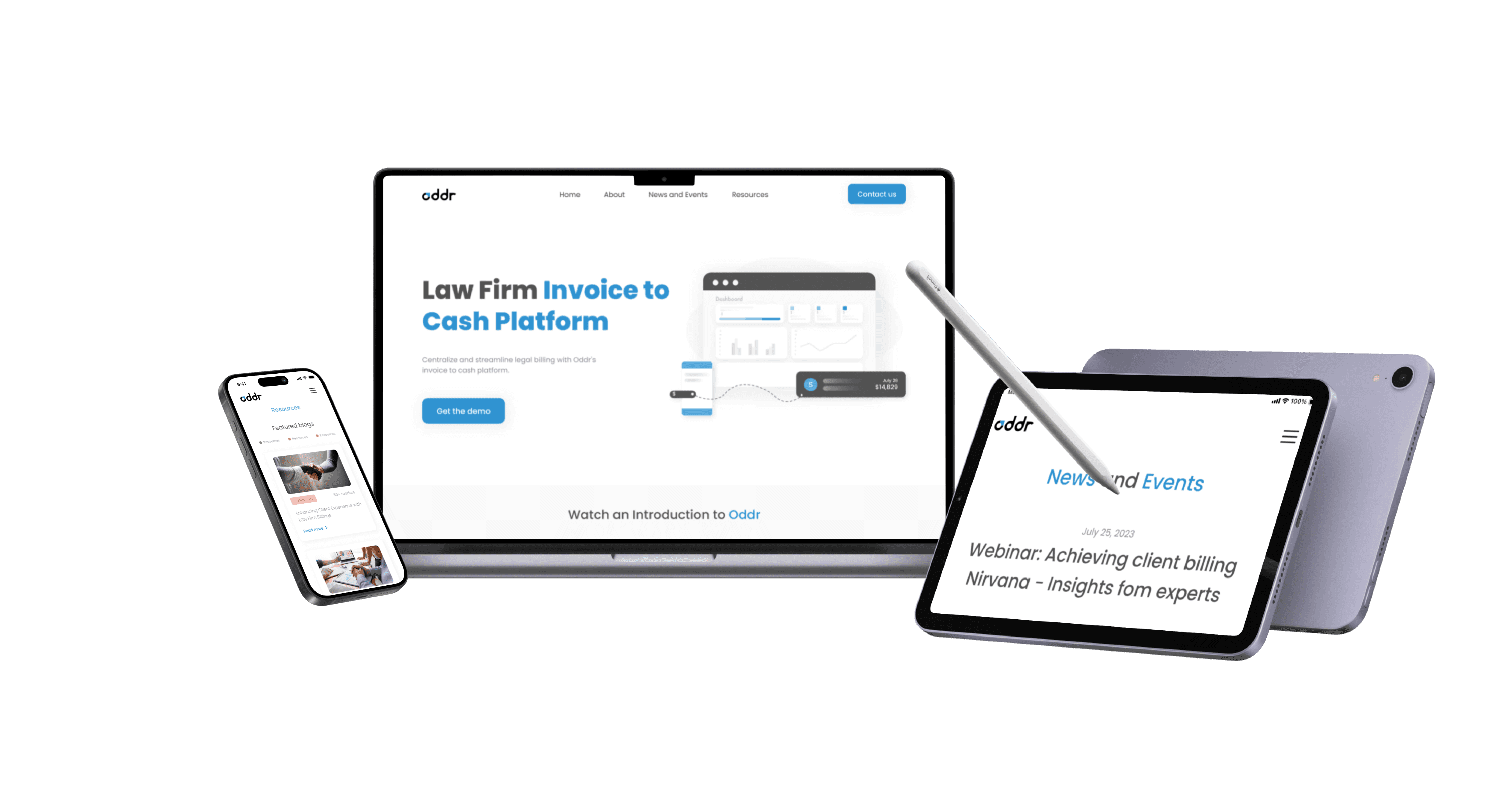
THE DEMO: See the Prototype

✅ Testimonials
Honorable Mention
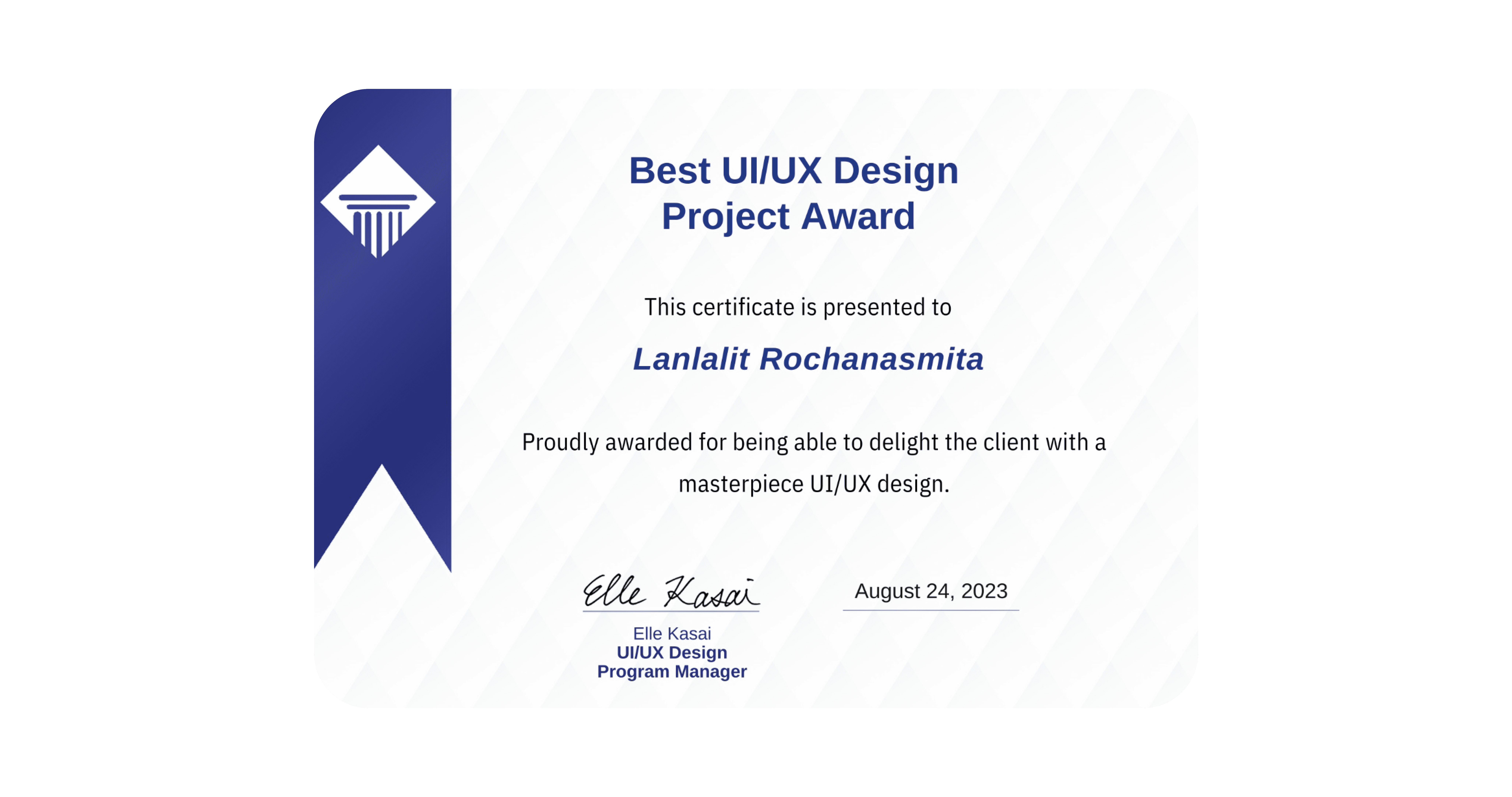
This project is the final course project from the specialist course of the UX/UI Diploma. We were honoured to win the Best Project award, chosen by both the clients and the professor.
Our project was recognized as the best due to its outstanding, remarkable, and distinguished design, making it an exemplary and superlative achievement in the UX/UI Diploma course.
Most importantly, the clients also applied our design solution in their existing website.
🔑Key takeaway
The UX/UI website redesign project for Oddr was a success, driven by a focus on user usability through Heuristic Evaluation. The collaborative effort of a 4-person team ensured the best design outcomes, particularly in making the website responsive for mobile and tablet users.
Project success was measured by client satisfaction and a 100% score in A/B testing. This experience provided valuable insights into applying UX methods in real-world scenarios and highlighted the importance of teamwork and client collaboration in achieving project goals.
Connect with me
Let's create together ✨
Read my UX case study article, Click to see my Notion
ODDR Lawfirm
Redesigned a SaaS website for a lawfirms invoice-to-cash management, aimed to make it a user friendly experience. August, 2023


The client
Oddr is an innovative business that pioneers the invoice-to-cash management platform known as SaaS (Software as a Service) website, aiming to revolutionize how law firms handle their invoicing process. Their mission is to centralize, streamline, and accelerate every aspect of invoicing, from bill creation and delivery to collections and reconciliation.
It's time to start !
New Simple makeover and enhance website usability, we assume that the website should say everything about your business and promote all your current products, services, and pricing. It should attract prospects and answer any and all questions they have about the company.
As a designers,

Design Challenges
Responsive Design - Our team came up with the idea to make the differentiation.
Diverse Screen Sizes and Devices With an ever-expanding range of devices, from smartphones and tablets to laptops and desktops, ensuring that the website looks and functions well on all screen sizes is the primary challenge for our team.

Things to Consider
The client has specified two key limitations and constraints for us to consider while following the brand guidelines: the existing logo and color scheme. Additionally, they have requested that we focus solely on redesigning the website visually, without altering any other aspects of the context.

🧪 Solutions
Heuristic Evaluation research
To diagnose these issues, we needed to perform a heuristic evaluation on the product. During this evaluation, "How might we" questions came up in our thoughts:

By identifying the usability in the existing website, we assessed each instance on a severity scale ranging from 1-5 to extent of the problems. We listed the complete set of usability problems that have been discovered by our team, and we asked the 10 participates to rate the severity of each problem and described in reasonable depth.

The Offenders
⚙️ Content
Heuristic violated: Flexibility and Efficiency of Use
Severity Rating: 5

⚙️ Alignment
Heuristic violated: Aesthetic and minimalist design
Severity Rating: 2

⚙️ Resources
Heuristic violated: Consistency and standards
Severity Rating: 4

⚙️ Credibility
Heuristic violated: Recognition rather than recall
Severity Rating: 2

Guide the user with "easier" App Navigation
After we analyzed the existing content, we have create the easiest information architecture solution.

Introducing the Oddr redesign UI kits

Low fi wireframe: Initial idea
The next step in my process was creating a low fidelity wireframes. Before settling on a more final version I used to reimagine, I explored a couple of options using different styles and reducing unnecessary elements from the existing Oddr website and played with the new front design as well.

After completing the initial wireframe for Oddr’s website, we undertook a redesign of a collection of responsive screens focused on their usability flow. This redesign was guided by a Heuristic Evaluation to enhance user usability.
We ensure that each screen not only aligns perfectly with established usability principles but also provides a seamless, intuitive user experience across all device types.

THE DEMO: See the Prototype

✅ Testimonials
Honorable Mention
This project is the final course project from the specialist course of the UX/UI Diploma. We were honoured to win the Best Project award, chosen by both the clients and the professor.
Our project was recognized as the best due to its outstanding, remarkable, and distinguished design, making it an exemplary and superlative achievement in the UX/UI Diploma course.

Most importantly, the clients also applied our design solution in their existing website.

🔑Key takeaway
The UX/UI website redesign project for Oddr was a success, driven by a focus on user usability through Heuristic Evaluation. The collaborative effort of a 4-person team ensured the best design outcomes, particularly in making the website responsive for mobile and tablet users.
Project success was measured by client satisfaction and a 100% score in A/B testing. This experience provided valuable insights into applying UX methods in real-world scenarios and highlighted the importance of teamwork and client collaboration in achieving project goals.
Connect with me
Let's create together ✨
Read my UX case study article, Click to see my Notion
ODDR Lawfirm
Redesigned a SaaS website for a lawfirms invoice-to-cash management, aimed to make it a user friendly experience. August, 2023


The client
Oddr is an innovative business that pioneers the invoice-to-cash management platform known as SaaS (Software as a Service) website, aiming to revolutionize how law firms handle their invoicing process. Their mission is to centralize, streamline, and accelerate every aspect of invoicing, from bill creation and delivery to collections and reconciliation.
It's time to start !
New Simple makeover and enhance website usability, we assume that the website should say everything about your business and promote all your current products, services, and pricing. It should attract prospects and answer any and all questions they have about the company.
As a designers,

Design Challenges
Responsive Design - Our team came up with the idea to make the differentiation.
Diverse Screen Sizes and Devices With an ever-expanding range of devices, from smartphones and tablets to laptops and desktops, ensuring that the website looks and functions well on all screen sizes is the primary challenge for our team.

Things to Consider
The client has specified two key limitations and constraints for us to consider while following the brand guidelines: the existing logo and color scheme. Additionally, they have requested that we focus solely on redesigning the website visually, without altering any other aspects of the context.

🧪 Solutions
Heuristic Evaluation research
To diagnose these issues, we needed to perform a heuristic evaluation on the product. During this evaluation, "How might we" questions came up in our thoughts:

By identifying the usability in the existing website, we assessed each instance on a severity scale ranging from 1-5 to extent of the problems. We listed the complete set of usability problems that have been discovered by our team, and we asked the 10 participates to rate the severity of each problem and described in reasonable depth.

The Offenders
⚙️ Content
Heuristic violated: Flexibility and Efficiency of Use
Severity Rating: 5

⚙️ Alignment
Heuristic violated: Aesthetic and minimalist design
Severity Rating: 2

⚙️ Resources
Heuristic violated: Consistency and standards
Severity Rating: 4

⚙️ Credibility
Heuristic violated: Recognition rather than recall
Severity Rating: 2

Guide the user with "easier" App Navigation
After we analyzed the existing content, we have create the easiest information architecture solution.

Introducing the Oddr redesign UI kits

Low fi wireframe: Initial idea
The next step in my process was creating a low fidelity wireframes. Before settling on a more final version I used to reimagine, I explored a couple of options using different styles and reducing unnecessary elements from the existing Oddr website and played with the new front design as well.

After completing the initial wireframe for Oddr’s website, we undertook a redesign of a collection of responsive screens focused on their usability flow. This redesign was guided by a Heuristic Evaluation to enhance user usability.
We ensure that each screen not only aligns perfectly with established usability principles but also provides a seamless, intuitive user experience across all device types.

THE DEMO: See the Prototype

✅ Testimonials
Honorable Mention
This project is the final course project from the specialist course of the UX/UI Diploma. We were honoured to win the Best Project award, chosen by both the clients and the professor.
Our project was recognized as the best due to its outstanding, remarkable, and distinguished design, making it an exemplary and superlative achievement in the UX/UI Diploma course.

Most importantly, the clients also applied our design solution in their existing website.

🔑Key takeaway
The UX/UI website redesign project for Oddr was a success, driven by a focus on user usability through Heuristic Evaluation. The collaborative effort of a 4-person team ensured the best design outcomes, particularly in making the website responsive for mobile and tablet users.
Project success was measured by client satisfaction and a 100% score in A/B testing. This experience provided valuable insights into applying UX methods in real-world scenarios and highlighted the importance of teamwork and client collaboration in achieving project goals.
Connect with me
Let's create together ✨
Read my UX case study article, Click to see my Notion